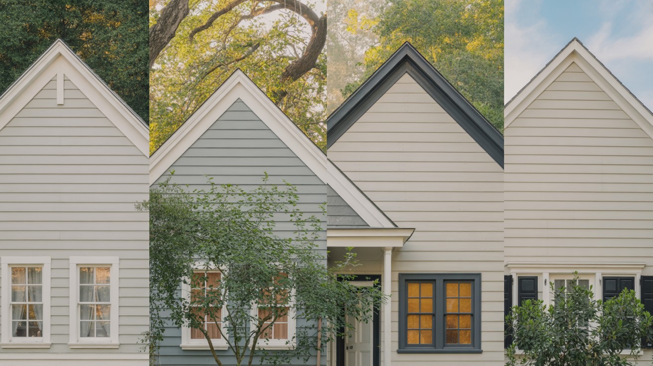
Choosing the perfect gray paint for your home can feel overwhelming with countless options available today.
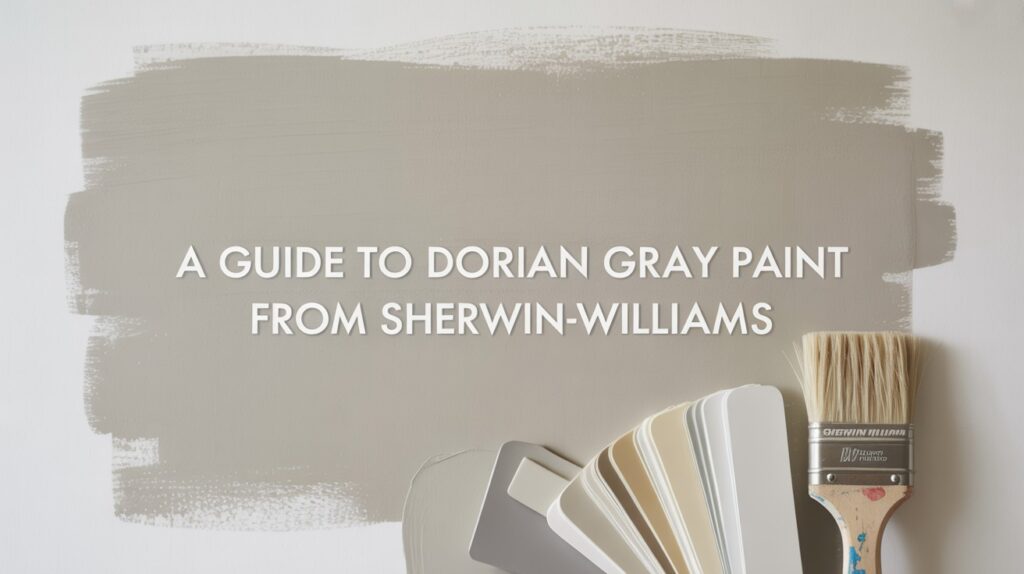
Dorian Gray SW 7017 from Sherwin-Williams has emerged as a standout choice, capturing the attention of homeowners and design professionals alike.
This medium-toned warm gray offers something different from typical cool grays that can feel stark or unwelcoming.
With its complex undertone profile and balanced depth, Dorian Gray provides the sophistication many seek while maintaining the warmth that makes a house feel like home.
Understanding this color’s unique characteristics, lighting responses, and best applications will help you determine if it’s the right choice for your next painting project.
What Is Dorian Gray SW 7017?
Dorian Gray SW 7017 is a popular paint choice from Sherwin-Williams that has gained attention for its versatility and sophisticated appearance.
Color Overview
Dorian Gray is a medium-toned warm gray that offers a balanced approach to neutral paint colors. With an LRV of 39, it provides balanced depth without being too dark for most spaces.
This positioning makes it accessible for various room types and lighting conditions.
The color has earned its place as part of Sherwin-Williams’ top neutral paint colors, reflecting its reliability and widespread appeal among homeowners and design professionals.
Understanding the Undertones
What makes Dorian Gray interesting is its complex undertone profile. The color contains subtle hints of purple, brown, and green that work together to create depth and character.
These mixed undertones mean that Dorian Gray may read as greige in certain lighting conditions.
The greige appearance occurs when the brown undertones become more prominent, creating a blend between gray and beige.
Environmental Factors
The undertones in Dorian Gray shift depending on your environment, materials, and light exposure.
Natural light throughout the day will emphasize different aspects of the color, while the existing materials in your space can bring out specific undertones.
This shifting quality means the color can look different from room to room or even at different times of day in the same space.
Wood elements might emphasize the brown undertones, while cooler materials could bring out the purple or green hints.
The Bottom Line
Dorian Gray SW 7017 offers a medium-toned warm gray with complex undertones that create visual interest. Its ability to shift between gray and greige depending on lighting and surroundings makes it a dynamic choice for those seeking a sophisticated neutral paint color.
How Dorian Gray Looks in Different Lighting
Understanding how Dorian Gray SW 7017 responds to various lighting conditions is crucial for making an informed paint decision. This popular Sherwin-Williams color changes significantly based on the light it receives, both indoors and outdoors.
Interior Lighting Effects
The way Dorian Gray appears inside your home depends heavily on the direction your rooms face and the amount of natural light they receive throughout the day.
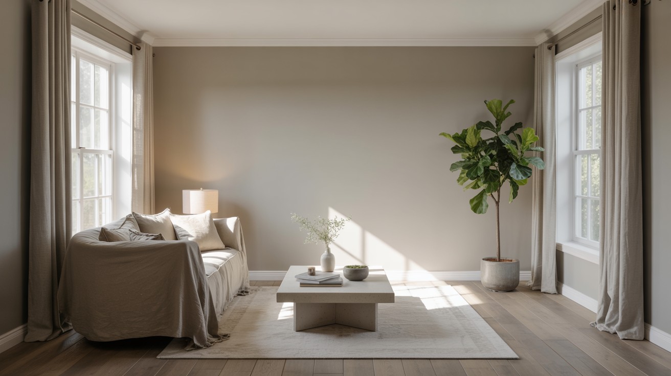
In north-facing or dim rooms, Dorian Gray tends to appear warmer and more greige in character.
The limited natural light in these spaces brings out the brown undertones, creating a cozier, beige-influenced appearance. This can be beneficial for rooms where you want a softer, more intimate feeling.
Well-lit, south-facing spaces show Dorian Gray at its most balanced gray state.
The abundant natural light helps maintain the true color without emphasizing any particular undertone too heavily.
These rooms typically display the color closest to how it appears on paint chips and online samples.
Throughout different times of day and depending on surrounding materials, Dorian Gray can appear slightly purple or green.
Morning light might emphasize cooler undertones, while afternoon light could bring out warmer aspects. The colors of nearby furniture, flooring, and textiles also influence which undertones become most visible.
Exterior Lighting Effects
When used on home exteriors, Dorian Gray behaves differently than it does indoors, responding to outdoor lighting conditions and surrounding elements.
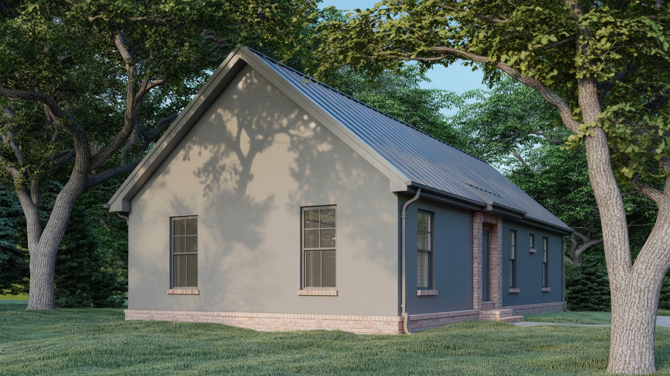
The color can lean green outdoors due to landscape reflection. Surrounding trees, grass, and other greenery cast subtle green light onto exterior surfaces, which can emphasize the green undertones already present in the paint.
This effect is particularly noticeable during spring and summer when vegetation is most vibrant.
The appearance of Dorian Gray on exteriors may look warmer or cooler depending on your roof color, brick elements, and hardscaping materials.
Red brick might bring out warmer brown undertones, while gray stone could emphasize cooler aspects.
Dark roofing materials can make the color appear lighter, while lighter roofing might make it seem deeper.
Interestingly, Dorian Gray is less likely to show purple undertones on exterior applications.
The outdoor lighting conditions and surrounding materials typically don’t create the specific circumstances that bring out the purple hints commonly seen in interior applications.
Planning for Light Changes
These lighting variations mean you should observe Dorian Gray samples at different times and in various conditions before making your final decision.
The color that appeals to you in morning light might look completely different by evening, so comprehensive testing helps ensure satisfaction with your choice.
Understanding these lighting effects allows you to choose Dorian Gray with confidence, knowing how it will perform in your specific space and lighting conditions.
Best Uses for Dorian Gray
Dorian Gray SW 7017 offers remarkable versatility across various applications, making it a smart choice for both interior and exterior projects. Understanding where this color performs best helps you make the most of its unique characteristics.
Interior Applications
Dorian Gray excels in multiple interior applications, proving its adaptability throughout the home.
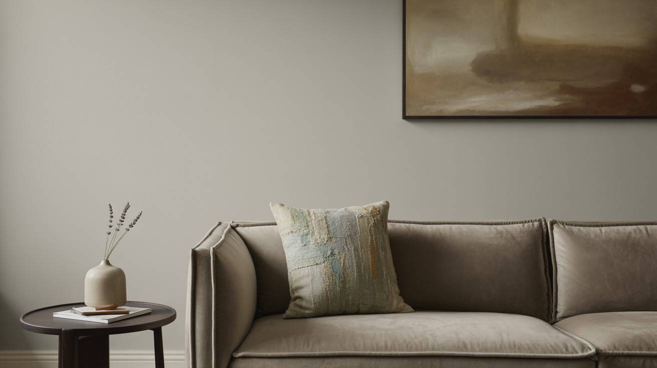
The color works beautifully on walls, creating a sophisticated backdrop that doesn’t compete with furniture or artwork.
Its medium tone provides enough depth to add character while remaining neutral enough to complement various design elements.
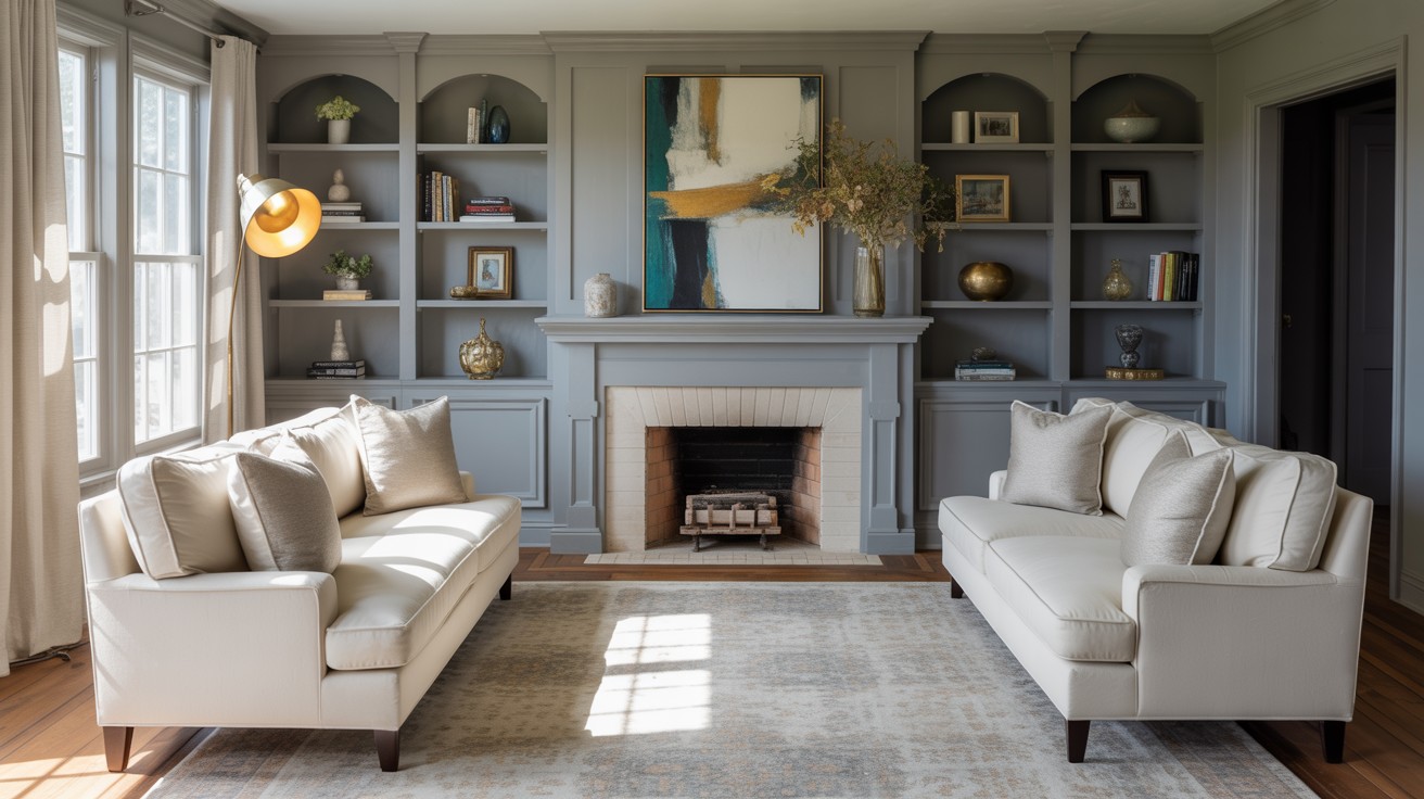
Beyond walls, this color performs exceptionally well on cabinetry and built-ins. Kitchen cabinets painted in Dorian Gray create a timeless look that bridges traditional and contemporary styles.
The warm undertones prevent the gray from feeling cold or institutional, making it ideal for spaces where you want sophistication without sacrificing warmth.
Built-in bookshelves, window seats, and other architectural features benefit from Dorian Gray’s balanced tone. The color adds definition to these elements without making them feel heavy or overwhelming in the space.
Exterior Applications
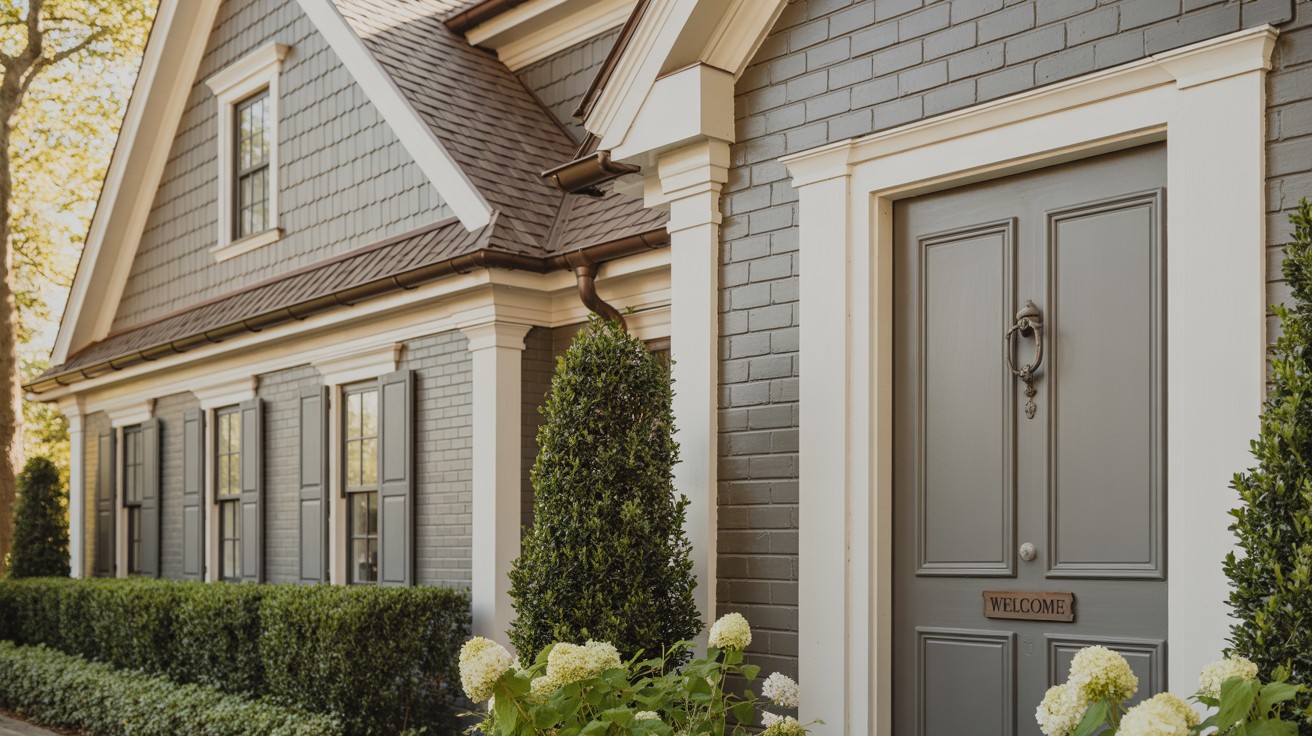
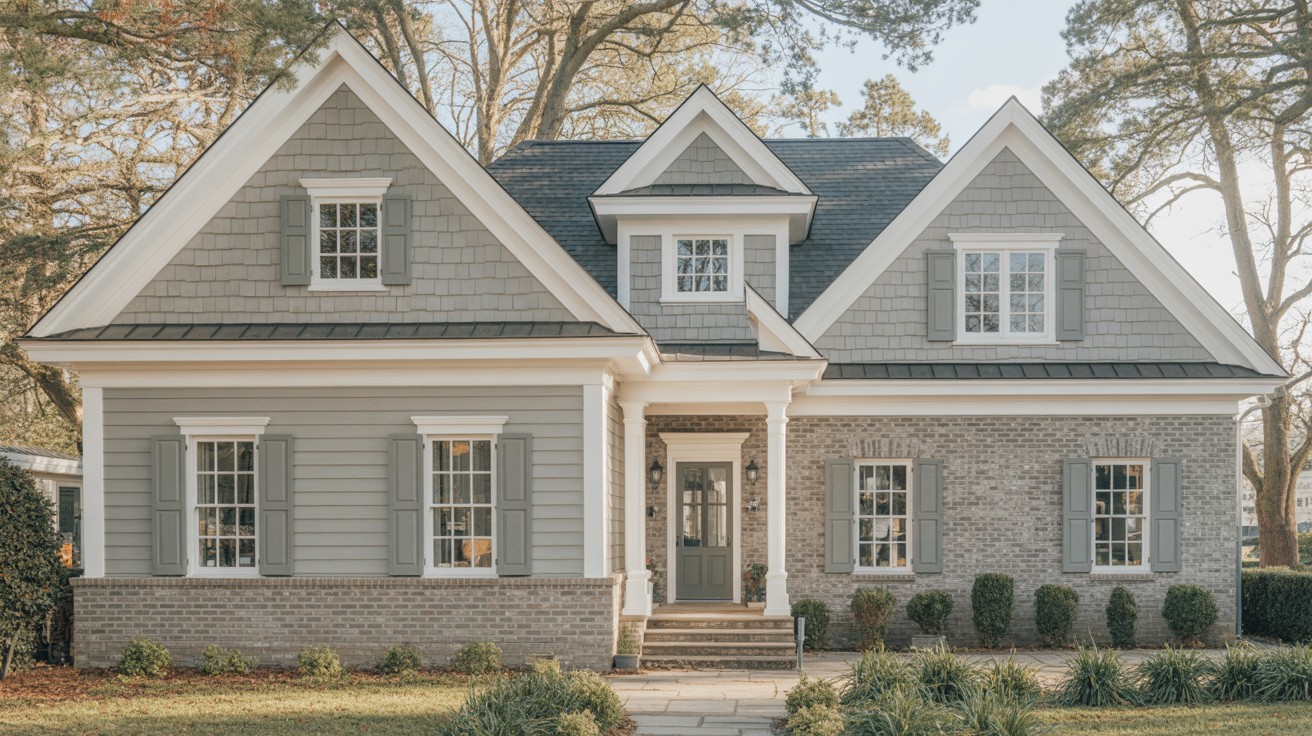
As a siding color, Dorian Gray performs excellently on traditional or transitional homes.
The color’s warm undertones complement classic architectural styles while remaining current enough for updated home designs. It provides a sophisticated alternative to beige or tan without venturing into trendy territory.
The color proves versatile across different siding materials. Vinyl siding in Dorian Gray maintains its color consistency and complements various trim colors.
On brick homes, it creates a cohesive look that doesn’t compete with the brick’s natural texture and color variations.
Stucco applications benefit from Dorian Gray’s ability to show texture while maintaining a clean, modern appearance.
The color’s medium tone provides enough contrast to highlight architectural details without overwhelming the home’s overall design.
Fiber cement siding painted in Dorian Gray combines durability with style. The color’s balanced tone works well with the material’s smooth finish and provides a contemporary look that ages gracefully.
Pros and Cons of Dorian Gray
Pros
- Warm and inviting: Creates a cozy, welcoming atmosphere unlike cooler grays that can feel sterile
- Classic appeal: Timeless color choice that won’t look dated in a few years
- Versatile compatibility: Works across a variety of home styles and materials, from traditional to contemporary
- Balanced depth: Doesn’t feel too heavy despite its medium tone and rich undertones
- Light reflection: LRV of 39 maintains openness while providing visual interest
Cons
- Too subtle for bold designs: Might not provide enough contrast for those wanting dramatic color statements
- Unpredictable undertones: Can shift between purple, brown, and green depending on lighting and surroundings
- Requires extensive testing: Must be evaluated carefully in your specific space and lighting conditions
- Not always consistent: Can look different from room to room or at different times of day
- May disappoint contrast seekers: Those preferring sharp contrasts between walls and trim might find it too moderate
Bottom Line
Dorian Gray works best for those who appreciate nuanced, adaptable colors but requires thorough testing due to its changeable nature.
Perfect Color Pairings for Dorian Gray
Finding the right colors to pair with Dorian Gray SW 7017 can make the difference between a good design and a great one. The key lies in understanding how different colors interact with its warm undertones and medium depth.
White Trim Colors
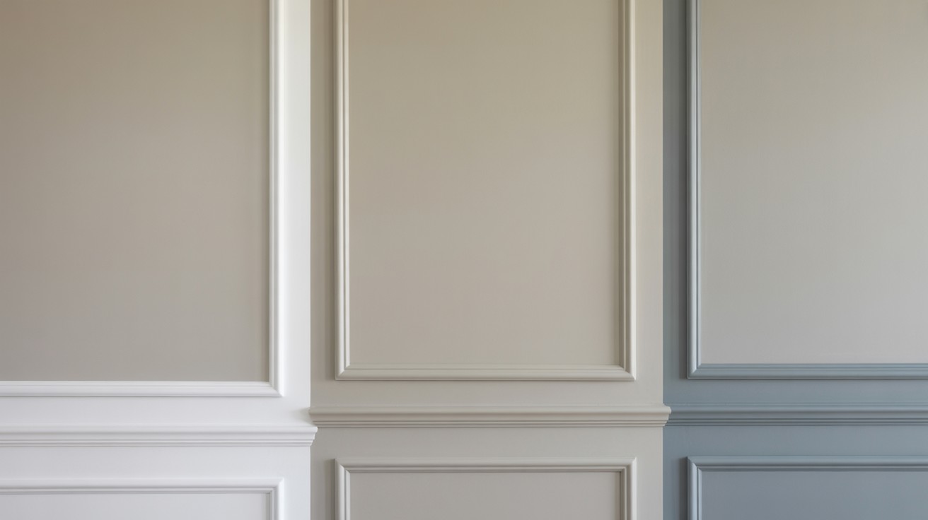
The right white trim can enhance Dorian Gray’s sophisticated character while providing the contrast needed to define architectural details.
SW Pure White creates a clean and crisp combination with Dorian Gray. This bright white provides excellent contrast without competing with the main color. The pairing feels fresh and contemporary while maintaining classic appeal.
SW Alabaster offers a soft and warm approach to white trim. This slightly warmer white complements Dorian Gray’s undertones beautifully, creating a cohesive look that feels comfortable and inviting. The combination works particularly well in traditional and transitional settings.
BM Chantilly Lace brings a bright and cool element to the pairing. This Benjamin Moore white provides crisp contrast while its cooler undertones help balance Dorian Gray’s warmth. The combination creates visual interest through temperature contrast.
Coordinating Exterior Colors
When using Dorian Gray as your main exterior color, these coordinating options can create stunning combinations for trim, shutters, and accent elements.
Light Accents
Seapearl provides a soft, sophisticated accent that complements Dorian Gray without competing for attention. This subtle color works beautifully for shutters or front doors.
Shoji White offers a clean, modern accent option that maintains the sophisticated feel of Dorian Gray while adding brightness to the overall design.
Swiss Coffee creates a warm, creamy accent that enhances Dorian Gray’s cozy undertones. This pairing feels particularly at home in traditional and farmhouse-style homes.
Dark Contrasts
Tricorn Black creates dramatic contrast with Dorian Gray, perfect for front doors, shutters, or architectural details. This combination feels both classic and contemporary.
Black Fox provides a softer alternative to pure black while still offering strong contrast. The slightly warmer undertones in Black Fox complement Dorian Gray’s character.
Urbane Bronze brings sophisticated depth to the pairing. This rich, dark color creates contrast while maintaining an earthy, grounded feeling that works well with Dorian Gray’s warmth.
Warm Companions
Deep Creek offers a rich, earthy companion color that enhances Dorian Gray’s warm undertones. This pairing creates a natural, organic feeling perfect for homes in wooded or natural settings.
Olympic Mountains provides a deeper gray-green option that complements Dorian Gray’s green undertones. The combination feels sophisticated and nature-inspired.
Cape May Cobblestone brings a warm, stony quality that pairs beautifully with Dorian Gray. This combination evokes the feeling of natural materials and timeless design.
Conclusion
Dorian Gray SW 7017 stands out as a versatile and sophisticated paint choice that brings warmth and character to any space.
Its complex undertone profile and medium depth create visual interest while maintaining the timeless appeal that homeowners seek.
While the color requires careful testing due to its changeable nature in different lighting conditions, this adaptability is also part of its charm.
From interior walls and cabinetry to exterior siding applications, Dorian Gray performs consistently well across various design styles and materials.
When paired with the right trim and accent colors, this warm gray creates cohesive, inviting spaces that feel both contemporary and classic, making it a smart investment for your next painting project.
Frequently Asked Questions
What makes Dorian Gray SW 7017 different from other gray paints?
Dorian Gray is a medium-toned warm gray with complex undertones of purple, brown, and green that create depth and character. Unlike cooler grays that can feel sterile, this color maintains warmth while providing the sophistication of a true gray.
How does lighting affect the appearance of Dorian Gray?
The color appears warmer and more greige in north-facing or dim rooms, while well-lit south-facing spaces show its most balanced gray state. Exterior applications can lean green due to landscape reflection and may look different depending on surrounding materials like brick or stone.
What are the best applications for Dorian Gray paint?
This versatile color works well on interior walls, cabinetry, and built-ins throughout the home including living rooms, kitchens, and bathrooms. For exteriors, it performs excellently as siding color on traditional or transitional homes across various materials like vinyl, brick, stucco, and fiber cement.
What white trim colors pair best with Dorian Gray?
SW Pure White creates a clean, crisp combination, while SW Alabaster offers a softer, warmer approach. BM Chantilly Lace provides bright, cool contrast that helps balance Dorian Gray’s warmth through temperature contrast.
Should I be concerned about Dorian Gray’s changing undertones?
The shifting undertones are part of what makes this color interesting and adaptable to different environments. However, extensive testing in your specific space and lighting conditions is essential to ensure you’re satisfied with how it appears throughout the day.

