
Are you bored with using the same 90s colour in your home? This blog is going to provide you with Top & Trendy Sherwin-Williams Moody Paint Colours, that are turning heads in 2025.
Moody paint colours are the ultimate trendsetters. These rich hues aren’t just about creating a statement-they’re about setting a mood, telling a story, and making your home feel uniquely yours.
I’m spotlighting the 10 top and trendiest moody paint colours from Sherwin-Williams to inspire your next design makeover. From luxurious charcoals to serene greens and bold blues, these colours are ready to turn your walls into master piece.
Let’s dive in and explore how these shades can redefine your space!
Why Choose Sherwin William Moody Paint Colors?
Sherwin-Williams’ moody paint colours have become a prominent trend in home design, and for good reason. No doubt, these rich, deep hues add instant sophistication and depth to any space, transforming ordinary walls into powerful statements.
The trend isn’t just about darker tones-it’s about creating a specific mood and ambience within a room. Whether you’re aiming for a calm, serene atmosphere with hues, Sherwin-Williams offers a range of colours that evoke emotion and transform your home into a personalized sanctuary.
One of the standout features of SW moody colours is their versatility. Unlike some trends that feel fleeting, these shades are timeless and can evolve with your decor.
They work seamlessly across various design styles-from modern and contemporary to rustic and traditional.
Choosing Sherwin-Williams for your moody paint needs also comes with the assurance of high-quality and durable finishes. The brand is known for its exceptional craftsmanship, offering paints that not only look stunning but also stand the test of time.
By embracing the moody paint trend from Sherwin-Williams, you’re bringing depth, warmth, and a touch of elegance into your space.
Best 10 Sherwin-Williams’ Moody Paint Colors
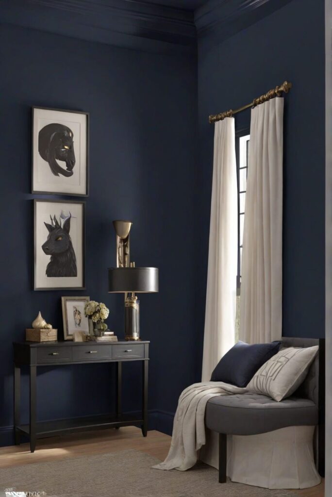
1. Naval SW 6244
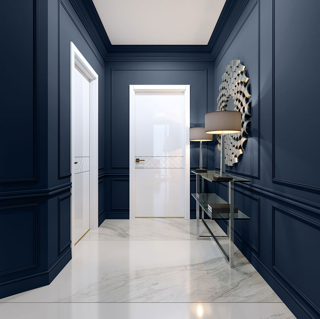
Naval is a deep, sophisticated navy blue with a subtle undertone, making it a versatile yet bold choice for those looking to make a statement.
The hue is rich but still feels fresh and timeless, making it ideal for contemporary homes.
Naval works beautifully as an accent wall in living rooms, home offices, or bedrooms, adding a sense of calm and refinement. It’s also an excellent choice for statement cabinetry, especially in kitchens and bathrooms.
You can pair it with white or brass accents for a striking contrast or balance it with softer neutral tones like light grey or beige for a more serene feel.
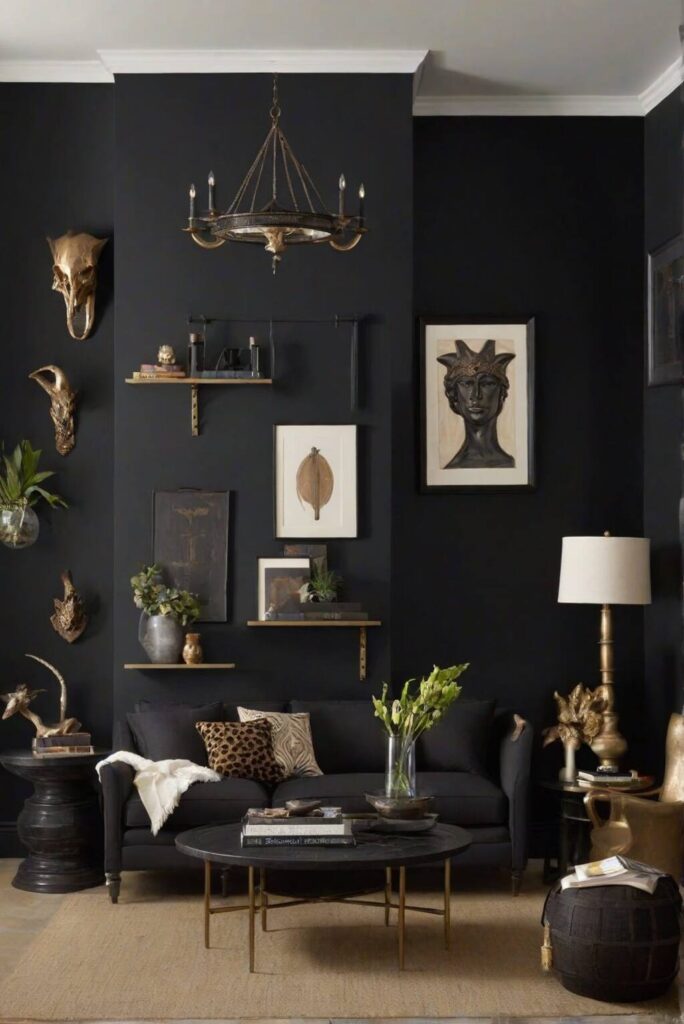
2. Iron Ore SW 7069
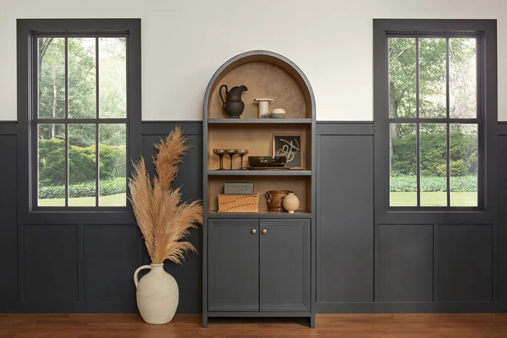
Iron Ore is a deep, charcoal grey that blends brown and black undertones. It’s a soft black that isn’t too harsh, offering a sophisticated alternative to true black.
This versatile colour exudes a modern, industrial feel while still maintaining warmth and depth.
Perfect for creating drama in a living room or adding sophistication to an entryway. Iron Ore also works well in kitchens and bathrooms, especially for cabinetry, trim, or feature walls.
You can Pair it with natural wood accents for a rustic-industrial look, or use it alongside gold or chrome fixtures for a contemporary touch.
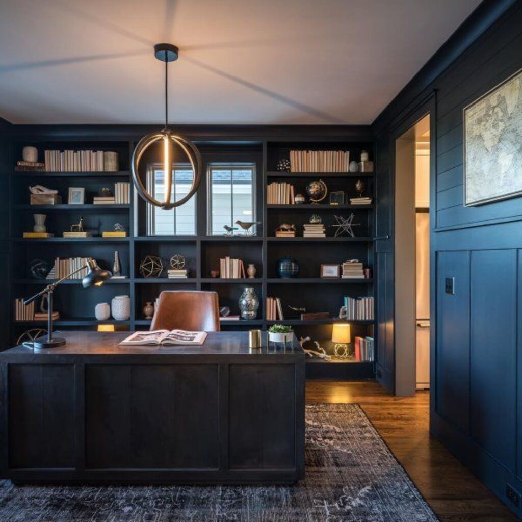
3. Urbane Bronze SW 7048
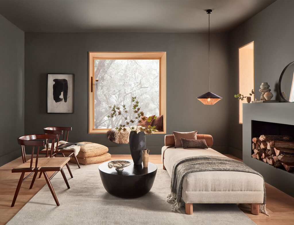
Urbane Bronze is a rich, dark brown with subtle green, creating a warm, earthy feel. This colour evokes a sense of serenity and natural elegance, offering a grounding effect that adds comfort and richness to any space.
Ideal for bedrooms and living rooms, Urbane Bronze works well in creating a cosy, welcoming atmosphere.
You can also consider it for feature walls or accent areas to bring warmth and texture. It also pairs beautifully with natural materials like wood, leather, and stone, making it perfect for home libraries, dining rooms, and even exteriors.
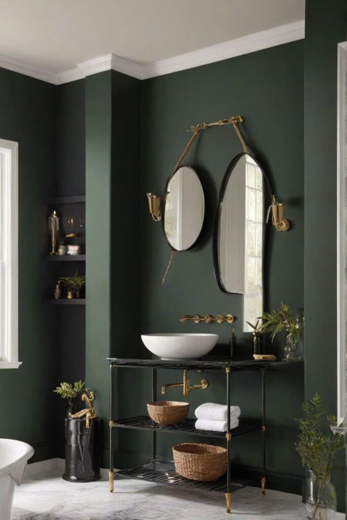
4. Rock Bottom SW 7062
Rock Bottom is a deep, earthy green with brown undertones, reminiscent of forest depths. This colour creates a grounded, organic feel that connects you to nature.
The muted tones of Rock Bottom make it a sophisticated, moody choice for creating a sense of calm and introspection in any room.
You can use Rock Bottom in spaces where you want to promote relaxation and focus, such as home offices, libraries, or reading nooks.
It also makes an excellent accent colour in living rooms, dining rooms, and kitchens, adding depth to an otherwise neutral palette. Combine it with textured fabrics like velvet or linen to highlight its richness.
5. Tricorn Black SW 6258
Tricorn Black is a true, deep black that offers a sleek, bold statement. This classic colour has a cool, neutral undertone, making it the perfect choice for modern or minimalist designs.
It adds drama and sophistication without feeling too heavy or oppressive. Tricorn Black is ideal for accent walls, cabinetry, and even furniture.
It’s perfect for making a statement in modern living rooms or kitchens, and it pairs wonderfully with contrasting whites or metals like chrome, gold, and silver. Consider it in your hallway for a chic entryway that wows guests as soon as they walk in.
6. Inkwell SW 6992
Inkwell is a deep, dark blue-black with hints of green, offering an almost inky, mysterious feel. It’s a rich, complex colour that can look almost black in low lighting, but in brighter settings.
Its blue undertones become more pronounced, making it ideal for creating a layered atmosphere.
Inkwell is a great option for spaces where you want to add drama and depth, such as home theatres, study rooms, or accent walls in living rooms or dining areas. It pairs beautifully with light-coloured wood furniture, metallic accents, and soft textiles to create a striking contrast.
7. Moody Blue SW 6221
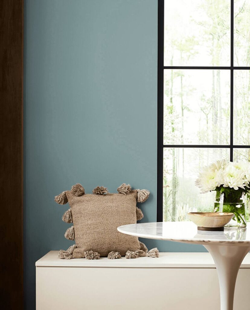
Moody Blue is a deep, smoky teal, giving it a refined yet slightly mysterious appearance.
It’s both calming and dramatic, with a cool, serene vibe that works well in both modern and traditional spaces.
Perfect for bedrooms, bathrooms, or even dining rooms, Moody Blue brings a soothing, tranquil ambience. Consider it for feature walls, ceilings, or cabinetry, especially when paired with natural wood tones or polished brass for a more luxurious look.
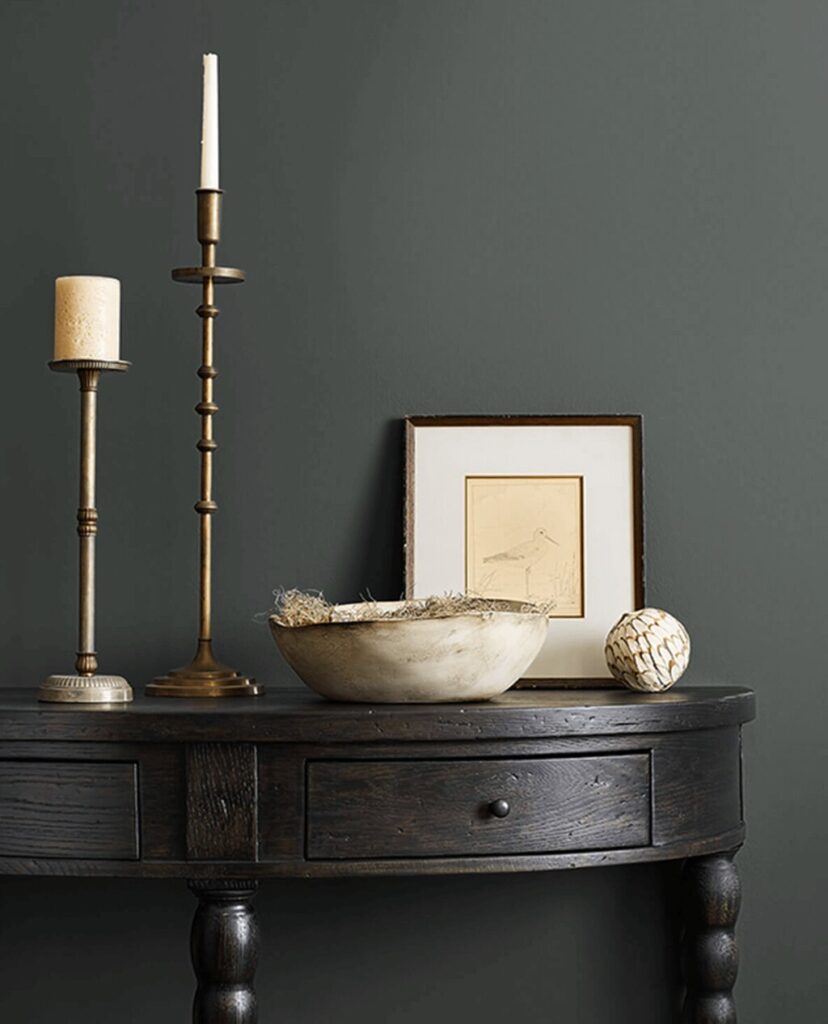
8. Sealskin SW 7675
Sealskin is a deep, dark brown with subtle hints of purple and green, making it a sophisticated, warm alternative to black. It has a soft, velvety quality that adds richness to any room.
Sealskin is an excellent choice for living rooms, dens, and libraries, where you want to create an intimate, cosy atmosphere.
It pairs well with earthy tones like olive, mustard, and deep red, making it ideal for spaces where warmth and comfort are key.
9. Dark Night SW 6237
Dark Night is a deep, almost-black blue, offering a moodily atmospheric look that adds richness and depth.
It feels sophisticated and timeless, without being overwhelming.
Dark Night works best in bedrooms, bathrooms, and living rooms where you want a sense of serenity and elegance.
It’s ideal for creating a restful, luxurious retreat when used on walls or cabinetry. It also pairs beautifully with natural wood finishes and muted metallics.
10. Green Black SW 6994
Green Black is a dark green with deep black undertones, creating a bold, dramatic look that still feels organic and earthy.
It’s a striking shade that provides a sense of mystery while evoking a connection to nature.
Green Black is perfect for adding a touch of elegance and drama to your home office, library, or hallway.
It works exceptionally well for cabinetry, doors, and feature walls. Pair it with natural textures like wood, stone, or marble for a modern yet grounded aesthetic.
Choosing the right Sherwin-Williams’ Moody Paint Colors
Here are a few tips to help you make the perfect choice:
- Consider Room Size and Lighting
- Match the Mood
- Blend with Existing Decor
- Think About the Flow Between Rooms
- Test on Smaller Areas First
Larger rooms with plenty of natural light can handle deeper shades like Naval SW 6244 or Iron Ore SW 7069, while smaller rooms or spaces with little natural light benefit from lighter moody colours like Moody Blue SW 6221.
For a serene, cosy atmosphere, go for warm tones like Urbane Bronze SW 7048. For a dramatic, sophisticated feel, darker hues like Tricorn Black SW 6258 or Inkwell SW 6992 are perfect.
Make sure the colour complements your furniture and finishes. Iron Ore SW 7069 pairs well with industrial decor, while earthy tones like Rock Bottom SW 7062 suit rustic spaces.
If you’re painting multiple spaces, consider how the shades will complement each other. For example, using Naval SW 6244 in the living room and Moody Blue SW 6221 in the bedroom can create a smooth transition, while keeping the mood cohesive throughout the house.
If you’re unsure about a particular moody shade, test it in smaller areas first. Try painting a small section of a wall or a piece of furniture before committing to the entire room.
Conclusion
In conclusion, choosing the right Sherwin-Williams Moody Paint Colors can truly elevate the personality of your home, adding depth, sophistication, and a sense of tranquillity.
By considering the mood you want to create, the lighting in your space, and how the colours flow from room to room, you can find the perfect shade that resonates with your unique style.
Don’t be confused about experimenting and testing colours in smaller areas before making a final decision-after all, your home should feel as personal and inviting as possible.
Embrace the trend, and let these moody hues transform your space into something extraordinary!
FAQs
Can I use Sherwin Williams’ dark moody colors in small rooms?
Yes! While dark colors can sometimes make small spaces feel more cramped, moody colors from Sherwin-Williams are designed to add depth without overwhelming a room. By using lighter moody tones, like Moody Blue SW 6221, or balancing dark shades with lighter accents and good lighting, you can create a cosy, inviting feel in smaller rooms.
What finishes are best for Sherwin-Williams’ moody colors-matte, satin, or gloss?
For Sherwin-Williams’ moody colors, satin finishes are often the best choice. They provide a soft sheen that enhances the depth and richness of the color without being too reflective, making them perfect for living rooms, bedrooms, and kitchens.
Are Sherwin-Williams’ moody colors easy to maintain?
Sherwin-Williams’ paints are known for their durability and long-lasting quality. SW Moody colors tend to hide dirt and fingerprints better than lighter shades, making them easier to maintain in high-traffic areas.
How do I sample Sherwin-Williams’ moody colors before committing?
To sample Sherwin-Williams’ moody colors before committing, try using their peel-and-stick paint samples or apply a small patch of paint on your wall. This allows you to see how the color looks in different lighting throughout the day and how it interacts with your existing decor, ensuring you’re happy with your choice before fully committing.
Do Sherwin-Williams moody paints have low-VOC options?
Yes, Sherwin-Williams offers low-VOC options for their moody paint colors. Their environmentally friendly paint lines, such as Harmony and Duration, provide a wide range of moody shades while maintaining low levels of volatile organic compounds, ensuring better indoor air quality without compromising on color richness or durability.
What is the most popular moody blue paint color by Sherwin-Williams?
The most popular moody blue paint color by Sherwin-Williams is Naval SW 6244. This deep, sophisticated navy blue has become a favorite for its timeless appeal and versatility, making it perfect for accent walls, bedrooms, and home offices, adding a calming yet dramatic atmosphere to any space.
Can Sherwin-Williams’ moody paint colors be customized or lightened?
Yes, Sherwin-Williams’ moody paint colors can be customized or lightened. You can request to have the color lightened by adjusting the formula at the store or mix it with other shades to create a unique variation that suits your space perfectly. Their team can help you achieve the exact tone you desire while maintaining the moodiness of the color.