
In this blog, I’ll show you how Sherwin Williams Moody Blue can transform your rooms, giving them a bold, inviting vibe without feeling too heavy.
Do you go for something bold that stands out or something subtle that blends in? What if you could have the best of both choices? The perfect solution—Sherwin Williams Moody Blue. It’s a color that promises not only to deliver elegance and depth but also to make small spaces feel more expansive.
Stick around, because by the end of this post, you’ll see why this deep, dramatic blue could be just what your space is missing. Ready to take the plunge? Let’s explore!
What is Sherwin Williams Moody Blue (6221)?
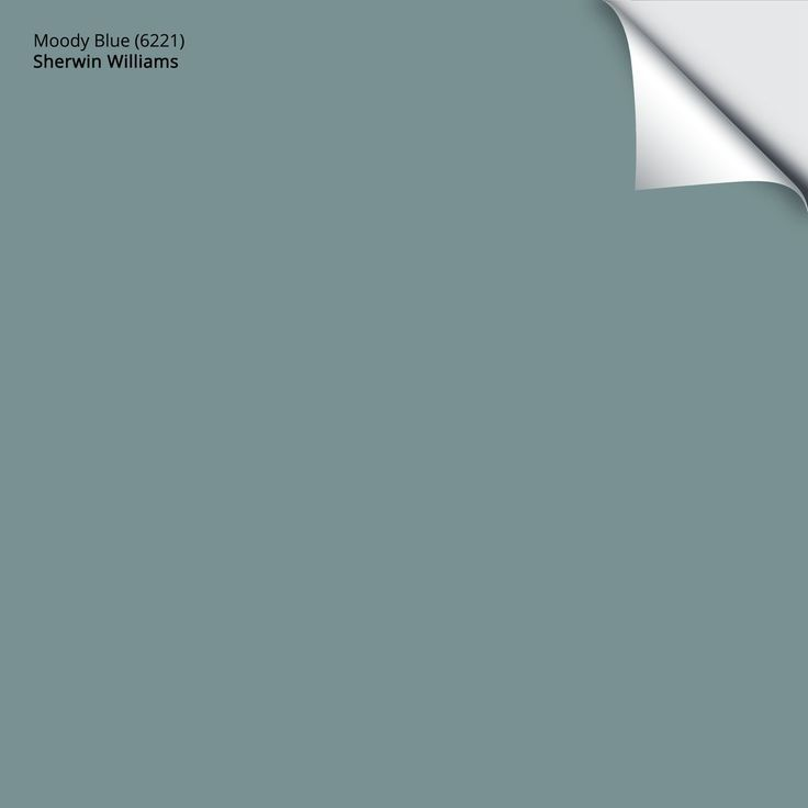
Sherwin Williams Moody Blue (SW 6221) is a deep shade that blends blue and gray, offering a rich, calming hue with a touch of drama.
SW Moody Blue has an LRV of 12, which is considered a relatively low value, meaning it absorbs a significant amount of light. The RGB (Red, Green, Blue) values of Moody Blue are 87, 102, and 112, respectively. This combination of medium-to-dark blue with a touch of gray contributes to the color’s balanced, grounded appearance.
It falls under the category of moody blues, meaning it creates a bold yet subtle atmosphere in any space. The color has versatile undertones, making it adaptable to various lighting conditions and decor styles.
Why to Choose Sherwin Williams Moody Blue?
When I first tried Sherwin-Williams Moody Blue, I wasn’t sure what to expect. I wanted something that felt calm yet had a little edge, and let me tell you—this color delivered beyond my expectations.
What I love most about SW Moody Blue is its depth and complexity. Depending on the lighting, it can shift from serene and peaceful to cozy and intimate, or even take on a striking, dramatic tone.
I used SW Moody Blue as an accent color, and wow—it completely transformed the room. It added just the right amount of depth and drama to my home while still letting other elements of the design breathe.
What’s even better is how flexible it is. It’s perfect for creating a calm, serene retreat. In natural light, it’s soft and soothing, but under warm lighting, it adds an extra layer of coziness.
Using SW Moody Blue feels less like painting a room and more like creating an atmosphere. It pairs effortlessly with so many design styles. This isn’t just a color; it’s a mood and a statement all in one.
If you’re thinking about trying it, I wholeheartedly recommend it. Trust me, you’ll fall in love with the way it transforms your space.
How lighting affects Sherwin Williams Moody Blue
Lighting can completely transform how Sherwin-Williams Moody Blue appears in your space. Here’s a quick breakdown to help you understand how different lighting conditions can affect this stunning color:
- Natural Light
In rooms with plenty of natural light, SW Moody Blue shows off its blue tones, making your space feel fresh and serene without being overwhelming. It’s perfect for sunlit living rooms or bedrooms. - Warm Light
Under warm lighting, SW Moody Blue softens, highlighting its gray undertones. This creates a cozy, intimate atmosphere, ideal for your dining rooms or bedrooms where you want a relaxed vibe. - Cool Light
Cool, daylight-like lighting deepens the blue, making your room feel more dramatic. This is great for larger rooms or spaces where you want to add a touch of luxury and modern flair. - Artificial Lighting at Night
At night, dim lights make SW Moody Blue feel peaceful and mysterious, while bright lights bring out its vibrant depth. You can also adjust the lighting to set the mood you want in your space.
Pro Tip: Always test a swatch in your space before committing, as lighting conditions can drastically change how the color appears. SW Moody Blue is versatile, so whether you have natural light or artificial, this color adapts beautifully to create the perfect atmosphere.
How to Pair Moody Blue with Other Colors Perfectly
When it comes to pairing Sherwin-Williams Moody Blue with complementary colors, the possibilities are endless.
Warm Neutrals
If you’re looking to create a balanced, serene space, warm neutrals are the perfect companions for SW Moody Blue. You can think of soft beiges, warm taupes, and crisp whites.
These colors won’t compete with SW Moody Blue, instead, they’ll ground the space and allow the blue tones to stand out without feeling overwhelming.
- Sherwin Williams Accessible Beige (SW 7036)
- Sherwin Williams Taupe Tone (SW 9173)
- Sherwin Williams Brandywine (SW 6622)
- Sherwin Williams Warm Stone (SW 7032)
Metallic Accents
For a touch of luxury, metallics are your go-to. SW Moody Blue looks stunning with the rich shine of gold and bronze accents.
Whether it’s a gold-framed mirror, bronze light fixtures, or metallic throw pillows, these accents bring a layer of elegance and sophistication that elevates the entire room.
- Sherwin Williams Alabaster (SW 7008)
- Sherwin Williams Egret White (SW 7570)
- Sherwin Williams Pure White (SW 7005)
- Sherwin Williams Repose Gray (SW 7015)
Earth Tones
If you want to soften the boldness of SW Moody Blue and bring in some warmth, earth tones like natural wood and terracotta are the perfect choice.
A wooden coffee table or terracotta vases will bring a grounded, organic feel to your space.
- Sherwin Williams Croissant (SW 7568)
- Sherwin Williams Late Harvest (SW 6386)
- Sherwin Williams Urbane Bronze (SW 7048)
- Sherwin Williams Sable (SW 6033)
Now that we’ve covered some great complementary colors, let’s look at how you can incorporate these color schemes into different design styles.
Coastal
For a relaxed, breezy coastal vibe, pair SW Moody Blue with soft sandy tones and light whites. Think beachy neutrals like pale beige or soft cream to evoke the feeling of a serene beach house. These colors create a fresh, airy space, while SW Moody Blue adds a deeper, oceanic touch.
Modern
For a sleek, contemporary look, SW Moody Blue pairs perfectly with the clean lines of whites, blacks, and stainless steel. Moody Blue accent wall against a backdrop of white furniture, black trim, and shiny stainless steel kitchen appliances. This high-contrast combination exudes modern elegance and style.
Traditional
For a more classic, timeless feel, pair SW Moody Blue with rich wood elements and deep green hues. SW Moody Blue on the walls with dark wooden furniture—like mahogany or walnut—and accents of deep forest green or olive. This combination creates a warm, inviting atmosphere that is both elegant and grounded.
Where to Use SW Moody Blue in Your Home
If you’re considering Sherwin-Williams Moody Blue, this versatile shade can elevate any room with its deep, calming vibe. Let me share some spots where it works wonders in your home:
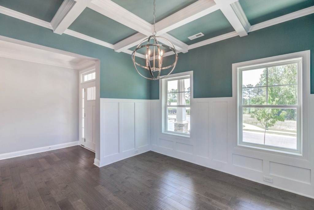
Sherwin Williams Moody Blue works wonderfully in the living room, whether as an accent wall or used around the entire space. This rich hue brings a cozy, sophisticated atmosphere, making it the perfect choice for a space where you want to make a bold statement.
If you’re looking to create a calm, restful environment in your bedroom, Moody Blue is the ideal choice. Its deep, cool tones offer a peaceful retreat, whether it’s used on a serene accent wall or as the backdrop behind your bed.
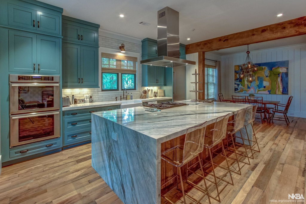
In the kitchen, SW Moody Blue can add a striking modern flair. Whether applied to cabinetry or as an accent on an island, this color provides a contemporary, fresh feel.
For a luxurious, spa-like experience in your bathroom, SW Moody Blue is a fantastic option. The color exudes serenity, making it perfect for walls or cabinetry, especially when paired with white tiles and gold accents.
The entryway and hallway are the first things your guests see, and SW Moody Blue makes an unforgettable first impression. Its rich, dramatic tones can transform these transitional spaces into something truly special, welcoming guests with style.
Conclusion
As you can see, Sherwin-Williams Moody Blue isn’t just a color—it’s a tool that allows you to shape the mood, atmosphere, and personality of your space. By now, you’ve seen how lighting can shift its mood, how it pairs beautifully with various color schemes, and where to place it in your home for maximum impact.
So, if you’re ready to introduce elegance, calm, and a bit of drama into your home, Sherwin-Williams Moody Blue could be just what you need. Don’t be afraid to take the plunge and let Moody Blue work its magic.
FAQs
Will SW Moody Blue work with my existing furniture?
SW Moody Blue is versatile enough to complement a wide range of furniture styles. Whether you have contemporary, traditional, or rustic pieces, this color will enhance your decor. It’s especially effective with neutral-toned furniture, natural wood, or metallic accents. It adds richness and depth without clashing.
How do I maintain the appearance of SW Moody Blue over time?
Like any high-quality paint, Moody Blue will look stunning for years if you keep it well-maintained. Regularly clean the walls with a soft cloth and mild detergent to prevent dust or dirt buildup. Sherwin-Williams’ paints are durable and resistant to fading, so your space will stay vibrant with minimal effort.
Can I use SW Moody Blue in spaces with lots of natural light?
Yes! In rooms with natural light, Moody Blue feels fresh and serene. The blue tones shine, creating a relaxed vibe. It’s ideal for living rooms, bedrooms, or sunrooms where you want a soothing atmosphere but still crave a bit of boldness. The natural light helps it maintain that lively, vibrant energy.
Can I mix SW Moody Blue with other shades of blue?
Yes! Layering different shades of blue can create a harmonious, layered look. Combining Moody Blue with lighter or more muted blues creates depth and dimension in the space. It’s a great way to introduce texture and visual interest while keeping the palette cohesive and tranquil.
How does Sherwin-Williams Moody Blue affect room size?
Moody Blue can make a room feel larger in some cases! In a smaller room, this deep, sophisticated hue can create a sense of openness and depth. It’s particularly effective in creating a cozy, inviting atmosphere without feeling too cramped. The key is balancing it with lighter accents and natural light to avoid making the space feel too closed in.
How do I know if SW Moody Blue is right for my home?
If you’re looking for a sophisticated yet bold color that can adapt to various lighting conditions and design styles, Moody Blue could be perfect for you! It’s ideal if you want to create a serene, inviting space with a touch of elegance and drama. If you’re unsure, always test a sample in your space first to see how it works with your furniture, lighting, and overall vibe.