
Moody paint colors are deep, rich hues like dark greens, deep blues, charcoal grays, and burgundies. They bring depth and character to a space, making a bold statement. Unlike neutrals, these shades create an immersive atmosphere, whether used on walls, trim, or as an accent.
These colors complement various design styles, from modern to vintage interiors. They pair well with wood, stone, and brass, adding warmth and contrast. As homeowners seek more personalized spaces, moody tones offer a timeless way to enhance any room.
Each shade influences mood differently. Blues and greens promote focus and relaxation, ideal for bedrooms or offices. Burgundy and auburn bring warmth, perfect for gathering spaces. Charcoal and black add elegance, giving rooms a refined, high-end feel. With the right lighting, these colors feel balanced and inviting.
Why Choose Moody Paint Colors?
Moody paint colors bring depth and character to any space. Shades like charcoal, navy, and forest green create a refined, high-end look, perfect for dining rooms, libraries, and entryways. These deep tones enhance architectural details and add a sense of intentional design, making your space feel curated and sophisticated.
Dark colors also create a comfortable, inviting atmosphere. A deep burgundy in a living room encourages relaxation, while a muted blue in a bedroom promotes calm. These shades pair well with wood, stone, and light furnishings, balancing depth with contrast. Contrary to popular belief, they can even make small spaces feel larger by drawing the eye beyond the room’s edges.
Best Moody Paint Colors for Your Home
Deep Greens & Earthy Tones
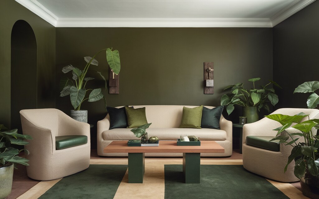
Deep greens bring a grounded, natural feel to any space. Ripe Olive by Sherwin Williams is a rich, classic green that works well in living rooms and studies, creating an elegant yet cozy atmosphere.
Jasper by Sherwin Williams is a slightly lighter but equally bold shade, ideal for bathrooms or accent walls. If you prefer a more muted green, Still Searching by Glidden offers a softer, earthy tone perfect for bedrooms or dining areas.
To incorporate deep greens, you can pair them with warm wood tones, brass fixtures, and neutral textiles. Use matte or satin finishes to enhance the richness of the color. Try painting trim and doors in the same shade for a seamless, high-impact look.
Dark Blues & Jewel Tones
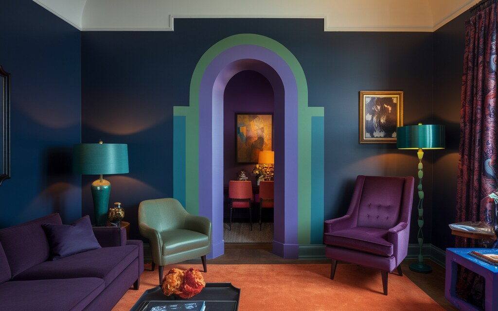
Dark blues create a calming yet dramatic effect. Ocean Swell by Behr, a deep blue-green, works well in home offices and reading nooks, fostering focus and relaxation. Indigo Cloth by Valspar is a true moody blue that feels rich and layered, making it a great choice for bedroom walls or built-in cabinets.
Riverway by Sherwin Williams, a blue-gray with warmth, blends seamlessly into contemporary and traditional interiors, adding subtle depth. To make dark blues stand out, contrast them with light-colored furniture, warm metallics, or crisp white trim.
You can use it for entire rooms, accent walls, or cabinetry to bring a sense of elegance and depth to your home.
Bold Reds, Purples & Dark Neutrals
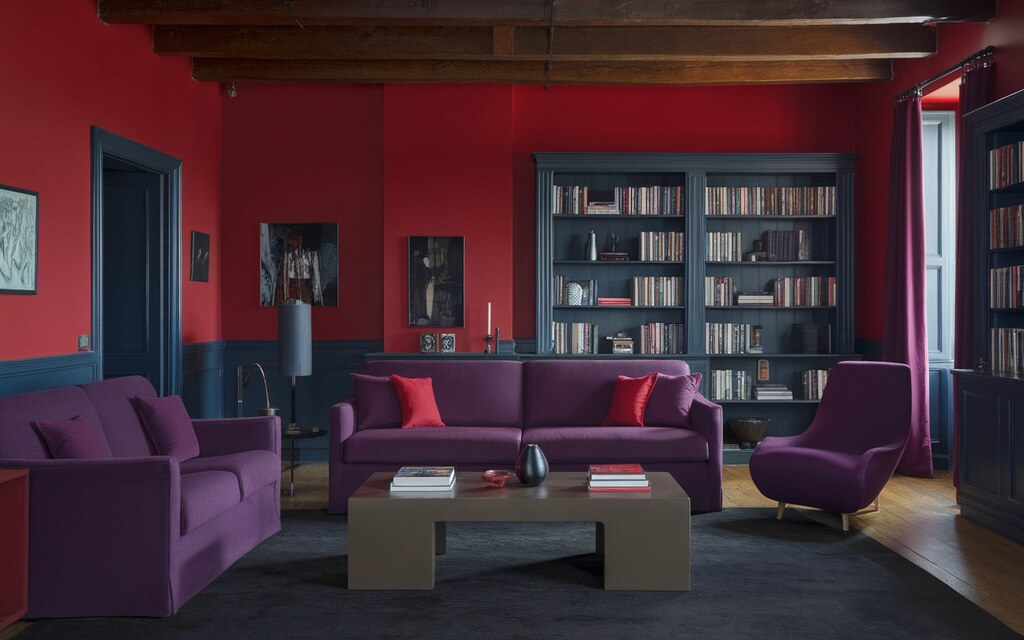
For a bold, dramatic statement, deep reds and dark neutrals are excellent choices. Dark Auburn by Sherwin Williams, a rich maroon, adds warmth and sophistication, perfect for dining rooms or moody bedrooms.
Iron Ore by Sherwin Williams, deep charcoal, works well on interior doors, kitchen cabinets, or entire walls for a sleek, modern look. Caviar by Valspar, a sophisticated black, brings refined contrast to any space, whether used on walls, trim, or ceilings.
To integrate these shades, balance them with light fabrics, warm woods, and soft lighting. You can use a matte finish for walls to enhance the depth, or choose a semi-gloss finish for doors and trim to create definition.
How to Use Moody Paint Colors Effectively?
Color Drenching for Impact
Painting walls, trim, and ceilings in the same shade create a seamless, immersive effect. This technique enhances depth and sophistication, making a space feel more intentional and cohesive.
Dark tones like charcoal, navy, or deep green work especially well for this approach. To apply this method, use a single rich color throughout the room. Opt for a matte finish for a velvety look.
You can introduce contrast through furniture, lighting, and metallic accents to maintain balance. This works best in bedrooms, dining areas, or home libraries, where depth and mood enhance the space.
Accent Walls for a Subtle Approach
An accent wall is a great way to introduce moody tones without overwhelming a room. A single deep color adds focus and contrast, making the space feel refined yet balanced.
This works well in living rooms, bedrooms, and offices, where a bold backdrop can define a space. To enhance an accent wall, you can pair it with lighter furnishings and neutral decor.
In bedrooms, placing a moody color behind the headboard creates a focal point. In-home offices, a deep charcoal or navy wall adds a sense of depth and professionalism. Keep surrounding walls light for contrast.
Balancing Dark Colors with Lighter Tones
Moody colors feel sophisticated and inviting when paired with complementary shades. Soft neutrals like beige, cream, and taupe prevent dark tones from feeling too heavy.
Brass, gold, and warm wood finishes add depth, while rust, terracotta, and muted pinks bring warmth. In a living room, you can pair deep green walls with light upholstery and wooden textures.
In the kitchen, balance dark cabinetry with white countertops and brass hardware. Layer textured fabrics like linen and velvet to add dimension.
Choosing the Right Paint Sheen
The paint finish affects how moody colors appear. Matte finishes absorb light, creating a rich, velvety effect, ideal for living rooms and bedrooms.
Satin or eggshell finishes work well in high-traffic areas like kitchens, offering a subtle sheen that reflects light.
For trim, doors, and cabinetry, a semi-gloss finish adds contrast and enhances architectural details. This approach keeps dark tones elegant and well-balanced in any space.
Styling & Decorating with Moody Colors
Lighting Matters
Lighting changes how moody colors appear. Natural light softens dark walls, making them feel open and inviting. A room with large windows will showcase undertones, making deep blues or greens appear more vibrant.
In low-light spaces, colors may read richer and more intense. Artificial lighting adds warmth and balance. Soft white or warm bulbs prevent moody shades from feeling too heavy.
Wall sconces, pendant lights, and floor lamps help distribute light evenly. For a dramatic effect, use spotlights on artwork or textured walls to enhance depth.
Furniture & Materials That Work Best
The right materials bring out the best in dark colors. Warm woods, brass, velvet, and leather add texture and contrast. A deep charcoal or navy wall pairs well with a walnut table or brass light fixtures.
These elements create a layered, balanced look. Soft materials prevent a space from feeling too dark. Velvet sofas, linen drapes, and plush rugs introduce warmth.
Leather chairs and metal accents provide contrast. Mix materials to keep the room visually engaging and inviting.
Accessories & Decor for Contrast
Contrast is key when working with moody colors. Mirrors reflect light, preventing dark spaces from feeling enclosed. A large, well-placed mirror enhances depth and makes a room feel more spacious.
Metallics add brightness. Gold, silver, or copper decor brings dimension to deep hues. Light-colored textiles, such as white cushions, cream throws, or beige curtains, balance the intensity of dark walls. Layering different textures and tones ensures a well-rounded, polished space.
Best Design Styles for Moody Paint Colors
Dark Academia
Dark Academia blends rich colors with vintage charm. Deep greens, plums, and browns create a classic, bookish feel. Dark wood shelves, antique furniture, and brass lighting enhance the aesthetic.
Use matte paint for a soft, aged effect. Add leather books, tufted chairs, and heavy drapes for warmth. A distressed desk completes the space.
Modern Gothic
Modern Gothic is bold and dramatic. Black, navy, or charcoal walls set the mood. Crystal chandeliers, iron fixtures, and velvet accents add contrast.
Choose semi-gloss or matte paint. Use dark wood, sculptural decor, and statement lighting. Gothic-style mirrors and rich textiles bring depth.
Rustic Elegance
Rustic Elegance pairs moody tones with natural textures. Deep greens, earthy browns, and muted grays complement wood and stone.
Apply matte or satin paint for softness. Mix woven textiles, rattan furniture, and raw wood beams. A stone fireplace and neutral fabrics add warmth.
Choosing the Right Moody Color for Your Room’s Function
Moody colors set the tone for how a space feels and functions. The right shade can enhance focus, relaxation, or warmth. Think about how you want to feel in the room before selecting a color.
-
Deep Greens for Focus
-
Burgundy for Warmth
-
Charcoal and Black for Elegance
-
Deep Blues for Calm
Shades like forest green or olive create a grounded and balanced atmosphere. They work well in home offices, libraries, or creative spaces. Green promotes concentration and reduces eye strain, making it ideal for areas where you need to stay sharp.
Rich reds and deep burgundies bring a cozy, inviting feel. They’re perfect for dining rooms and living areas where warmth and conversation matter. These shades encourage social interaction and make a space feel more intimate.
Dark grays and black add a refined, upscale look. Use them in entryways, bedrooms, or bathrooms for a sleek, modern feel. Pair with soft lighting to keep the space from feeling too heavy.
Navy, indigo, and midnight blue create a sense of peace. These shades work well in bedrooms and reading nooks where relaxation is key. Blue tones help lower stress and improve sleep quality.
Conclusion
With the right lighting, materials, and accents, moody colors can transform any space into a sophisticated retreat. Whether you start with an accent wall or go all-in with color drenching, these deep hues add elegance and personality.
Take your time experimenting with different shades in various lighting conditions to find the perfect match. Your home should reflect your style so embrace the drama and make a bold statement with moody paint colors.
FAQs
Do moody paint colors make a room feel smaller?
Not necessarily! Dark hues can create depth, making a space feel cozy yet expansive. When paired with strategic lighting, mirrors, and contrasting decor, moody colors can make a room feel more inviting and sophisticated rather than cramped. It’s all about balance!
What’s the best finish for moody paint colors?
A matte finish enhances richness and depth, giving the walls a velvety, high-end look. If you prefer a bit of light reflection, opt for satin or eggshell. High-gloss finishes work well for trims and doors, adding contrast and dimension to your space.
What colors pair well with moody shades?
Moody colors shine when paired with warm neutrals, metallics, and deep jewel tones. Think brass, soft creams, warm woods, and muted pinks to add contrast and prevent the space from feeling heavy. Layering textures like velvet, leather, or linen also enhances the look beautifully.
Can I use moody paint colors in a small room?
Absolutely! Small rooms thrive with dark colors because they create an intimate, cocoon-like feel. To keep it balanced, use ample lighting, reflective decor, and contrasting trim. A deep shade on all walls, paired with light furniture and accents, can make the room feel bigger and bolder!
Are moody paint colors trendy or timeless?
Moody colors are timeless because they evoke depth, sophistication, and warmth. While trends may shift, deep hues like charcoal, forest green, and navy have remained classics in interior design. The key is in styling—pair them with versatile decor, and they’ll always feel fresh and modern.
How do I test a moody paint color before committing?
Paint large swatches on multiple walls and observe them morning, noon, and night. Lighting changes everything! For a no-mess option, use peel-and-stick samples to visualize the color before committing. Trust your gut—it’s your space!