
Choosing the right neutral paint color can make or break your home’s atmosphere.
Two of the most popular choices among homeowners today are Pale Oak and Revere Pewter, both celebrated for their versatility and timeless appeal.
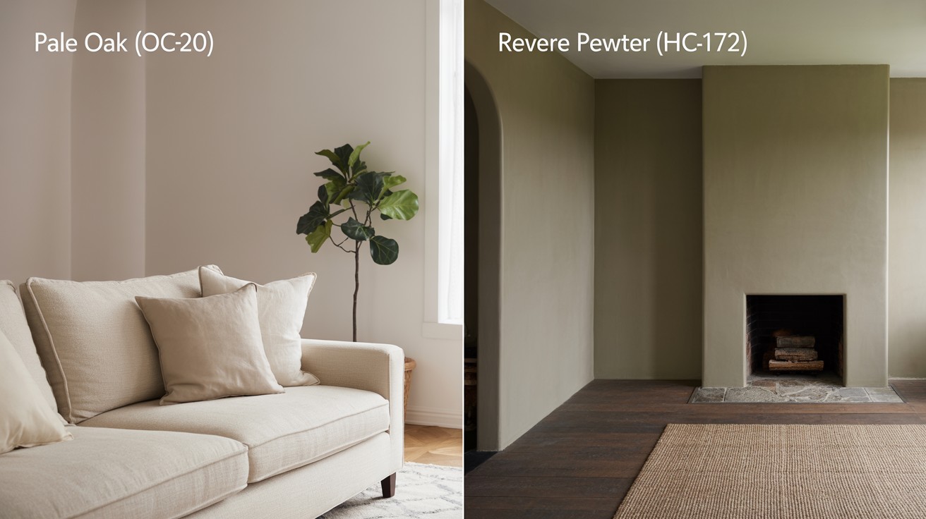
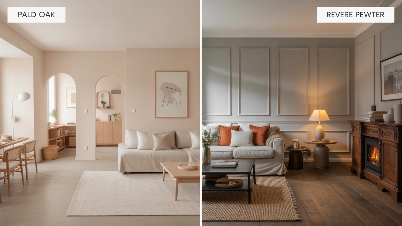
Pale Oak offers a soft, warm undertone that creates an inviting feel, while Revere Pewter provides a balanced greige that works beautifully in various lighting conditions.
This comparison matters because selecting the wrong neutral can leave your space feeling cold, outdated, or simply not quite right.
Many homeowners struggle between these two beloved shades, unsure which will complement their specific lighting, furniture, and lifestyle needs.
By the end of this guide, you’ll have the clarity needed to confidently choose the perfect color for your space.
Side-by-Side Comparison Table
| Feature | Pale Oak (OC-20) | Revere Pewter (HC-172) |
| Color Family | Warm greige | Deeper greige |
| LRV | ~68.64 (lighter) | ~55.05 (darker) |
| Undertones | Pink/Violet | Green |
| Room Impact | Airy, soft | Warm, grounded |
| Best Lighting | North-facing, low-light | South-facing, well-lit |
| Mood | Light and calming | Cozy and classic |
Meet the Contenders
What Is Pale Oak (OC-20)?
Pale Oak stands as a warm greige that beautifully balances soft beige and gray tones.
With a Light Reflectance Value of approximately 68.64, this color reflects considerable light, making it an excellent choice for spaces with limited natural light or smaller rooms that need to feel more open and airy.
The color carries subtle pink and violet undertones that become more apparent in certain lighting conditions, adding depth and warmth to walls.
These gentle undertones prevent the color from feeling sterile or cold, instead creating a cozy, welcoming atmosphere that complements both modern and traditional design styles.
What Is Revere Pewter (HC-172)?
Revere Pewter represents the classic greige family with a deeper gray presence that commands attention.
Its Light Reflectance Value sits at approximately 55.05, meaning it absorbs more light than Pale Oak, creating a more grounded, substantial feel in rooms.
This color works particularly well in larger spaces where you want to add warmth and visual weight to the walls.
Revere Pewter features muted green undertones that shift throughout the day, sometimes appearing more gray in northern light and revealing warmer qualities in southern exposure.
How Lighting Affects Each Color
Comprehensive comparison of two popular neutral paint colors to help homeowners choose the perfect shade for their interior spaces.
Pale Oak in Different Light
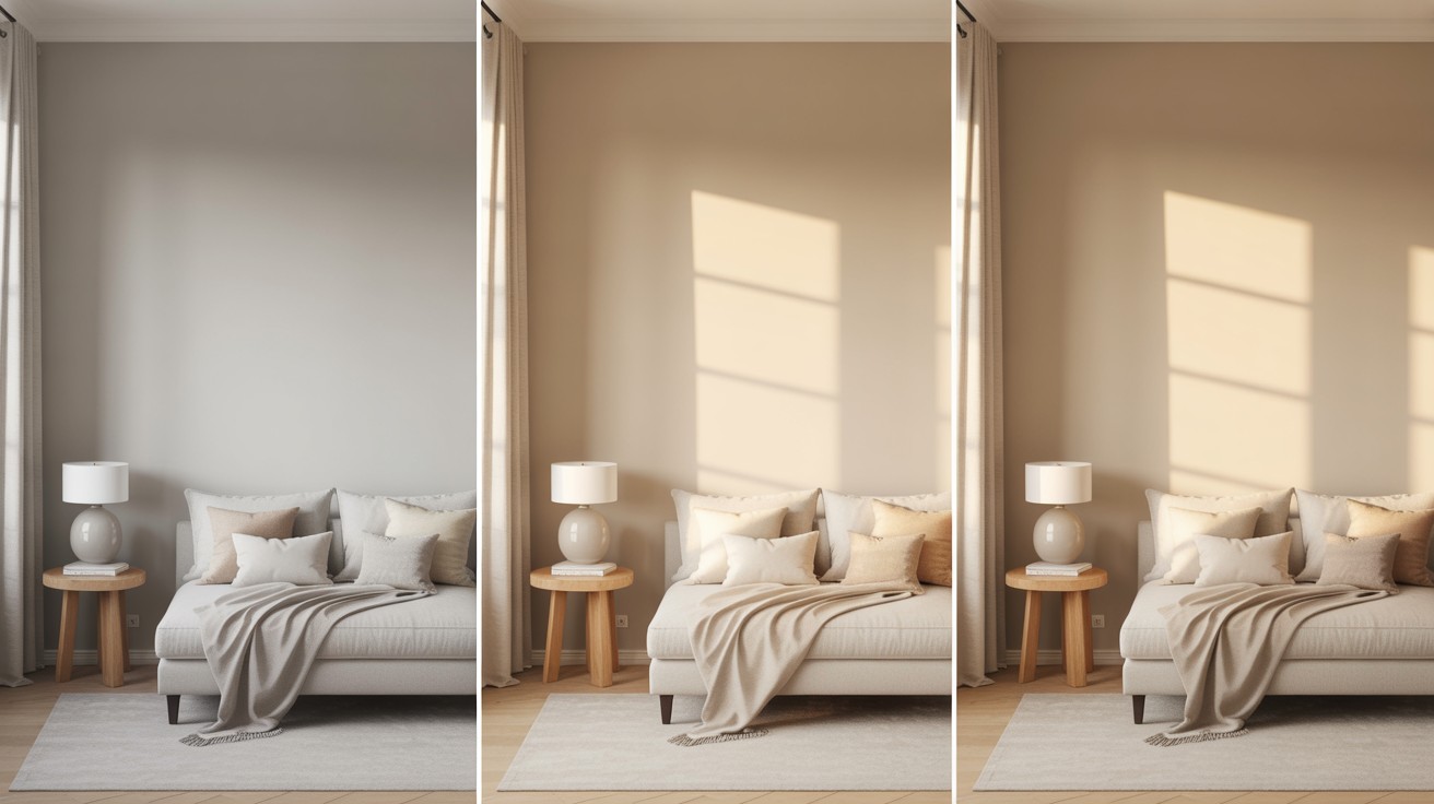
Pale Oak demonstrates remarkable versatility as lighting conditions change throughout the day.
In shadowy areas or during overcast weather, the color leans more toward its gray components, creating a clean, modern appearance.
When natural sunlight streams in, particularly during golden hour, the beige elements become more prominent, warming the space considerably.
However, this color can appear somewhat flat in consistently dark rooms that lack adequate natural light or accent lighting.
To combat this issue, consider adding table lamps, wall sconces, or overhead fixtures that will help bring out the color’s warmer undertones and prevent it from looking washed out.
Revere Pewter in Different Light
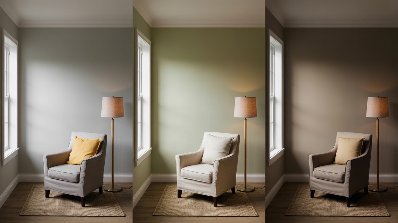
Revere Pewter truly shines when bathed in natural daylight, where its complex undertones create a rich, inviting atmosphere.
The color appears most balanced during mid-day hours when bright, indirect light brings out both its gray and beige qualities.
In well-lit spaces, those subtle green undertones add sophistication without overwhelming the overall neutral palette.
However, this color can become problematic in consistently low-light environments, where it may appear too dark or take on a muddy quality that makes rooms feel smaller and less welcoming.
Spaces with northern exposure or limited windows may struggle with this color choice.
Best Room Applications
Learn which rooms work best with each paint color based on lighting conditions, size, and intended function.
Ideal Spaces for Pale Oak
- Bedrooms: Soft, calming qualities create a serene atmosphere perfect for rest and relaxation
- Bathrooms: Light-reflecting properties work well in smaller powder rooms or spaces with limited windows
- Offices: Clean, focused appearance promotes productivity without being stark or clinical
- Hallways with limited natural light: Higher LRV helps transitional spaces feel brighter and more open
Ideal Spaces for Revere Pewter
- Living rooms: Grounding qualities create an inviting focal point for family gatherings and entertaining
- Dining rooms: Feels both formal and comfortable, making meals more intimate while maintaining sophistication
- Open floor layouts: Provides visual continuity without monotony, helping define different areas while maintaining flow
- Well-lit family spaces: Abundant natural light brings out complex undertones and creates a warm, lived-in feeling
Design Style Match-Up
Discover which interior design styles complement each paint color to create cohesive, harmonious spaces throughout your home.
Pale Oak Fits With
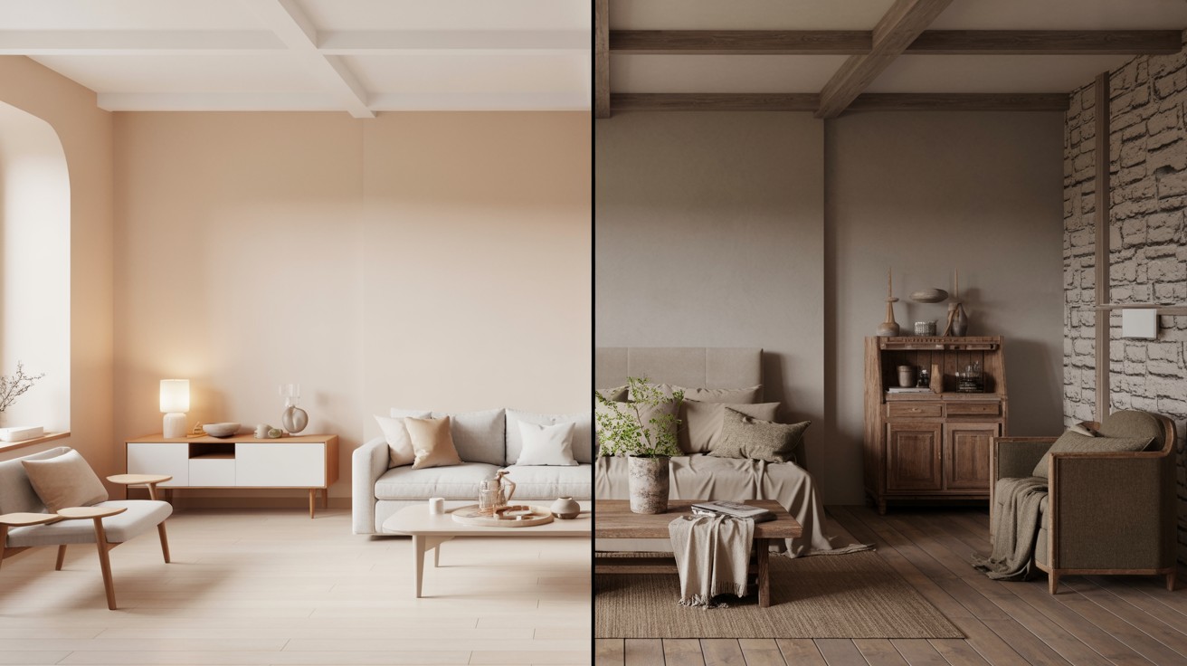
Pale Oak works beautifully in modern and minimalist interiors where its clean, understated appearance complements sleek furniture and uncluttered spaces.
The color supports Scandinavian design principles perfectly, as its light, airy quality aligns with Nordic emphasis on simplicity and maximizing natural light.
This shade also excels in bright, airy design schemes where its high light reflectance supports open-concept layouts and spaces specifically focused on creating an illuminated, spacious feeling throughout the home.
Revere Pewter Fits With
Revere Pewter shines in traditional or transitional homes where its timeless appeal successfully bridges classic and contemporary design elements.
The color works exceptionally well with rustic or farmhouse decor, as its earthy undertones naturally complement vintage-inspired furnishings and natural materials.
Spaces featuring wood tones and natural accents benefit greatly from Revere Pewter’s muted green undertones, which harmonize beautifully with wooden furniture, stone surfaces, and organic textures to create a cohesive, grounded aesthetic.
Common Mistakes to Avoid
When using Pale Oak, homeowners often make the mistake of placing it in rooms with excessive direct sunlight, where the color appears washed out and loses its subtle character as intense light overwhelms the delicate undertones.
Another frequent error involves pairing Pale Oak with bright white trim work, creating an unwanted contrast that makes the wall color appear dingy rather than sophisticated.
With Revere Pewter, the most common mistake is using it in dark, small rooms where its lower light reflectance value makes spaces feel cramped and oppressive rather than cozy.
Additionally, failing to balance Revere Pewter with lighter decor elements results in a muddy appearance that lacks visual interest, making the space feel monotonous and heavy instead of sophisticated and grounded.
Which One Should You Choose?
Final recommendations to help you decide between these two popular neutral paint colors based on your specific needs.
Choose Pale Oak If…
Pale Oak is your ideal choice when you prefer lighter, modern vibes that create an open, contemporary feel throughout your home.
This color works exceptionally well if your space lacks adequate sunlight, as its higher light reflectance value helps brighten darker areas and makes rooms feel more spacious.
Additionally, if you want a soft, versatile neutral that adapts to different lighting conditions while maintaining its gentle character, Pale Oak provides the flexibility you need for a timeless yet fresh appearance.
Choose Revere Pewter If…
Revere Pewter becomes the perfect selection when you want warmth and contrast that adds depth and character to your walls.
This color excels if your rooms are large and well-lit, where its lower light reflectance creates a grounded, substantial feeling without overwhelming the space.
Furthermore, if your decorating style leans traditional or cozy, Revere Pewter’s classic appeal and rich undertones will complement your existing furnishings and create the inviting atmosphere you desire.
Conclusion
Both Pale Oak and Revere Pewter offer distinct advantages for homeowners seeking the perfect neutral paint color.
Pale Oak provides a lighter, more reflective option with pink-violet undertones that work well in smaller or darker spaces, while Revere Pewter offers deeper warmth with green undertones that ground larger, well-lit rooms.
The key difference lies in their light reflectance values and how they respond to various lighting conditions throughout the day.
Before making your final decision, always test both colors in your specific space using large paint samples.
Lighting, existing furnishings, and room size dramatically affect how these colors appear.
Consider using both colors throughout your home in different areas-Pale Oak for bedrooms and bathrooms, Revere Pewter for living areas-creating a cohesive yet varied palette that adds visual interest while maintaining harmony.
Frequently Asked Questions
What’s the main difference between Pale Oak and Revere Pewter?
Pale Oak is a lighter greige with pink-violet undertones and an LRV of 68.64, while Revere Pewter is a deeper greige with green undertones and an LRV of 55.05. The key difference lies in their light reflectance-Pale Oak brightens spaces while Revere Pewter adds warmth and depth.
Which color works better in small rooms?
Pale Oak is the better choice for small rooms due to its higher light reflectance value that makes spaces appear larger and brighter. Revere Pewter can make small rooms feel cramped and dark because it absorbs more light.
Can I use both colors in the same home?
Yes, using both colors creates a balanced, cohesive palette throughout your home. Consider Pale Oak for bedrooms and bathrooms, while using Revere Pewter in living rooms and dining areas for optimal results.
How do these colors look with white trim?
Pale Oak can clash with bright white trim, making it appear dingy, so softer whites work better. Revere Pewter pairs beautifully with crisp white trim as the contrast enhances both colors without competing.
Which color is more versatile for different lighting conditions?
Pale Oak adapts better to various lighting conditions, especially low-light situations, maintaining its character throughout the day. Revere Pewter requires good natural light to look its best and can appear muddy in darker spaces.