
Thinking of using a soft neutral for your home but stuck between Pale Oak and Edgecomb Gray? You’re not alone in this dilemma.
These two Benjamin Moore favorites consistently rank among the most popular paint choices for good reason, both are undeniably beautiful options that can transform any space.
However, while they may appear similar at first glance, each offers distinctly different characteristics and atmospheres.
Understanding these subtle yet important differences will help you make the right choice for your specific needs.
From undertones and light reflection to how they perform in various room settings, we’ll break down everything you need to know.
By comparing these colors side-by-side, you’ll gain the confidence to pick the perfect neutral that truly complements your space and personal style preferences.
Meet the Colors
Before comparing these popular neutrals, it’s important to understand the fundamental characteristics that define each color. Both offer greige qualities but express them in distinctly different ways.
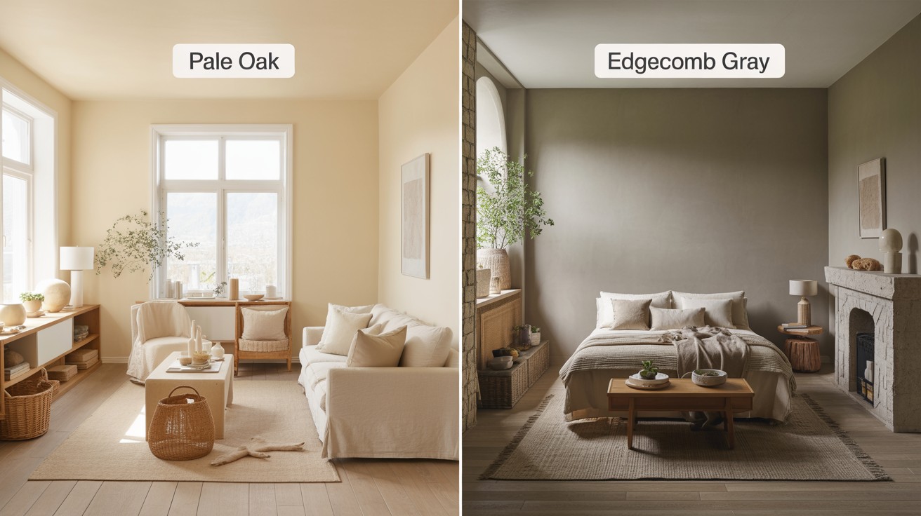
What is Pale Oak?
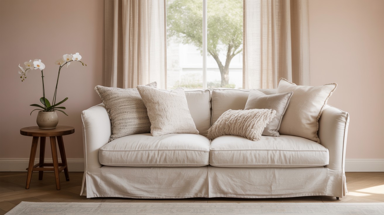
Pale Oak presents itself as a light greige foundation enhanced by notably warm undertones that create an airy, soft atmosphere in any space.
This color demonstrates interesting complexity through occasional pink or lavender shifts, particularly when exposed to certain lighting conditions or when paired with specific furnishings.
The warm base makes it an excellent choice for creating inviting, comfortable environments that feel naturally bright and welcoming without appearing stark or cold.
What is Edgecomb Gray?
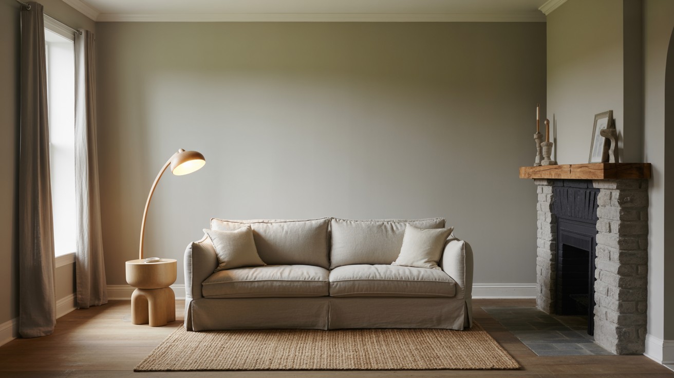
Edgecomb Gray offers a balanced greige composition that brings earthy depth to interior spaces while maintaining sophisticated neutrality.
Appearing slightly darker than Pale Oak, this color features distinctive green-gray undertones that provide a grounded, natural feeling.
The earthy influences give Edgecomb Gray a substantial presence that works beautifully in spaces where you want to create a sense of calm stability without sacrificing style or contemporary appeal.
| Feature | Pale Oak (OC-20) | Edgecomb Gray (HC-173) |
| Color Family | Greige with creamy warmth | Greige with earthy balance |
| Undertones | Beige, yellow, pink/lavender | Green-gray, taupe warmth |
| LRV | 68.64 (lighter) | 63.09 (darker) |
| Hue | 42 – more orange | 43 – more yellow |
| Saturation | 21 – slightly softer | 22 – a touch richer |
| Best For | Bright, airy rooms | Cozy, calm spaces |
| Trim Matches | Chantilly Lace, Pure White | White Dove, Simply White |
| Similar SW Color | Egret White | Agreeable Gray |
What Each Color Looks Like
Understanding how these colors actually appear in real living spaces helps you visualize their potential in your own home. Both colors offer distinct personalities that can dramatically influence the mood and atmosphere of any room.
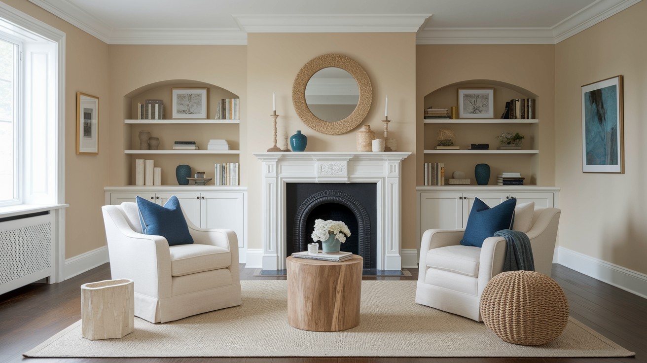
Pale Oak in Real Spaces
Pale Oak presents itself as soft, warm, and welcoming in most residential settings.
In rooms with abundant natural light, this color takes on an almost beige-like quality that feels incredibly inviting and comfortable.
The creamy warmth becomes more pronounced during daylight hours, creating spaces that feel naturally bright and open.
This color has a way of making rooms feel larger and more spacious while maintaining a cozy, lived-in quality that never feels cold or sterile.
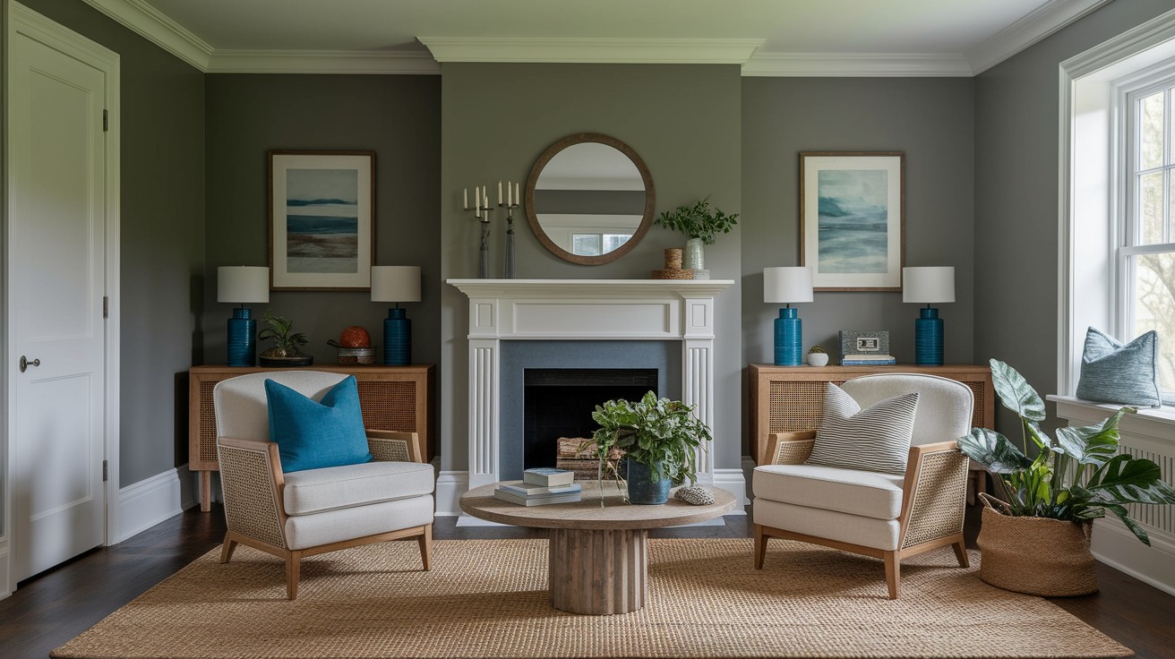
Edgecomb Gray in Real Spaces
Edgecomb Gray creates a calm, balanced, and inherently cozy atmosphere that works beautifully in various room types.
This color appears slightly deeper than Pale Oak, providing gentle contrast and visual interest without introducing any harsh darkness to your space.
The earthy undertones give it a grounded, sophisticated feel that works particularly well in rooms where you want to create a sense of tranquility and relaxation while maintaining enough depth to feel substantial and purposeful.
How They React to Light
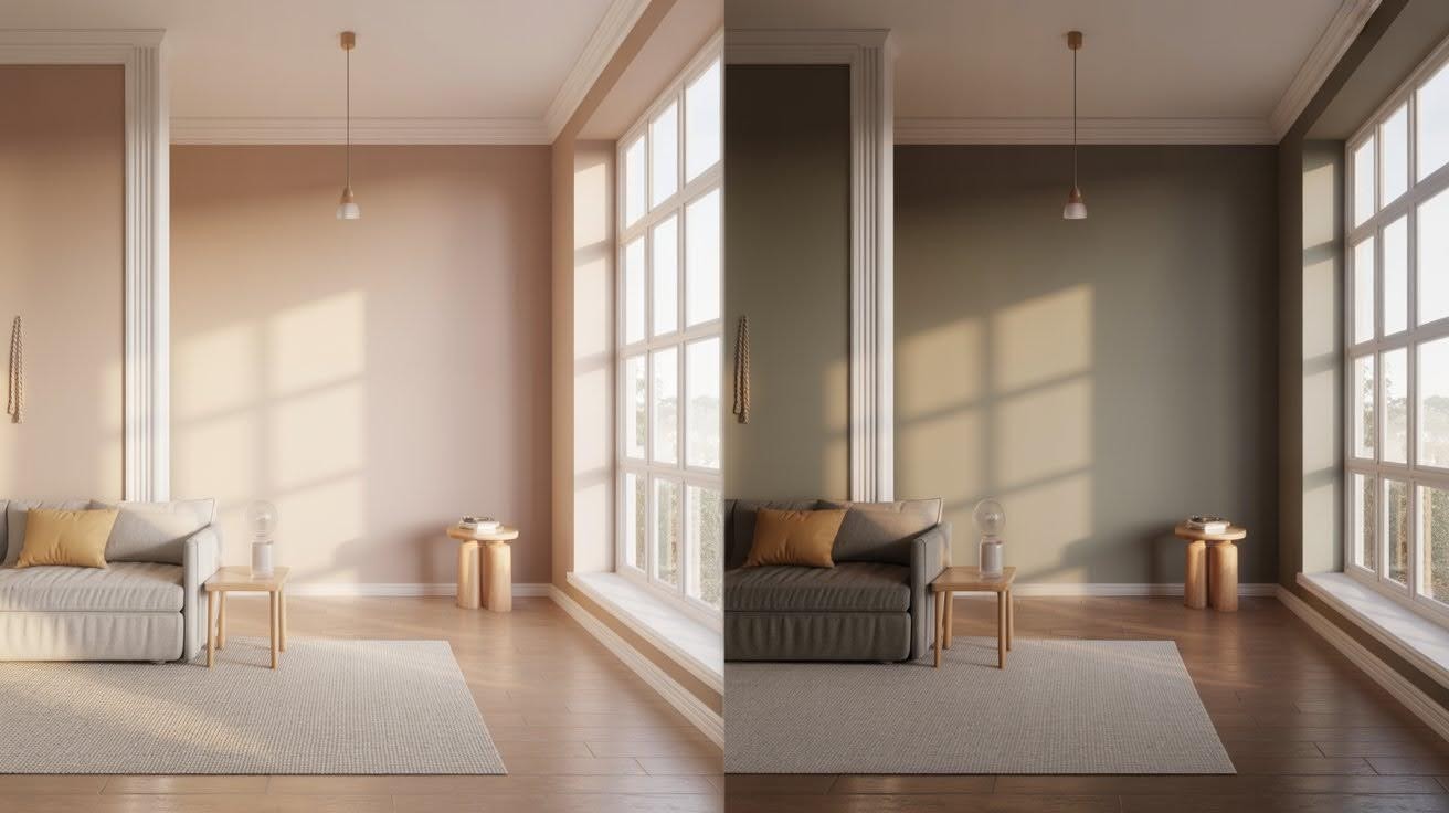
Light plays a crucial role in how these colors perform throughout the day, and understanding their behavior in different lighting conditions will help you make the best choice for your specific space.
Pale Oak
With its higher LRV of 68.64, Pale Oak reflects significantly more light than its counterpart, making it an excellent choice for rooms that need to feel brighter and more open.
Throughout the day, this color demonstrates remarkable adaptability, often shifting toward off-white or creamy beige tones depending on the intensity and direction of light.
In bright morning or afternoon sun, Pale Oak can appear almost white, while in softer evening light, its warm undertones become more prominent, creating a cozy glow that feels naturally inviting.
Edgecomb Gray
Being slightly darker with an LRV of 63.09, Edgecomb Gray absorbs more light, creating a more intimate and grounded feeling in most spaces.
This color shows its true character in varying light conditions, often appearing more taupe or greige when natural light is limited.
In low light situations, the green-gray undertones become more noticeable, giving the color additional depth and sophistication.
Evening lighting tends to bring out the earthier qualities, making spaces feel more settled and comfortable.
Trim and Accent Color Pairings
Selecting the right trim and accent colors can make or break your overall design scheme. Each of these neutrals works best with specific complementary colors that enhance their natural characteristics.
With Pale Oak
- Trim Colors: Chantilly Lace and Pure White provide the perfect crisp contrast against Pale Oak’s warm undertones
- These bright whites help define architectural details while allowing the wall color to maintain its soft, welcoming quality
- Accent Color – Hale Navy: Creates a classic, timeless combination that feels both sophisticated and comfortable
- Accent Color – Sea Salt: Brings in a gentle blue-green that complements the warm base beautifully
- Accent Color – Chelsea Gray: Adds depth and drama for those wanting a more contemporary feel
With Edgecomb Gray
- Trim Colors: White Dove and Simply White serve as ideal trim companions for Edgecomb Gray, offering enough warmth to harmonize with the color’s earthy undertones without competing for attention
- These trim choices maintain the balanced, grounded feeling that makes this color so appealing
- Accent Color – Wythe Blue: Provides a soft, serene contrast that feels naturally calming
- Accent Color – Hearth Red: Introduces warmth and energy while staying true to the color’s traditional sensibilities
- Accent Color – Grey Owl: Creates a sophisticated monochromatic scheme that feels modern yet timeless
Tips for Testing Before Painting
Proper color testing is essential for making the right choice between these two popular neutrals.
Taking time to properly evaluate each option will save you from costly mistakes and ensure satisfaction with your final decision.
Use peel-and-stick samples from companies like Samplize rather than relying on small paint chips from the store.
These larger samples provide a much more accurate representation of how the color will actually appear on your walls.
The increased size allows you to see the color’s true character and how it interacts with your existing furnishings and lighting conditions.
Test samples in multiple spots throughout the room and observe them at different times of day.
Morning light, afternoon sun, and evening artificial lighting can dramatically alter how each color appears.
Pay particular attention to how the colors look during the times you’ll be using the space most frequently.
Avoid making decisions based solely on digital images or tiny paint chips, as these can be misleading and don’t account for your specific lighting conditions.
Colors that look perfect online may appear completely different in your actual space, so always invest in proper physical samples before committing to a full room of paint.
Final Thoughts: Which Should You Choose?
Making the final decision between these two exceptional neutrals comes down to the specific atmosphere you want to create in your space.
Choose Pale Oak when you’re seeking a softer, brighter, creamier feel that makes rooms feel more open and airy.
This color works particularly well in spaces where maximum light reflection and warmth are priorities.
Opt for Edgecomb Gray when you prefer a more grounded, slightly deeper neutral that provides subtle sophistication and earthy balance.
This choice excels in creating calm, stable environments with just enough depth to feel substantial.
Still can’t decide between them? The best approach is to sample both colors side-by-side in your actual space and let your specific lighting conditions guide the final choice.
Your room’s natural light will reveal which option truly complements your home.
Frequently Asked Questions
Which color works better in rooms with limited natural light?
Edgecomb Gray performs well in low-light situations because its deeper tone and earthy undertones create a cozy, intimate feeling even without abundant sunlight. Pale Oak may appear flat or washed out in dimly lit spaces, though it can still work if you prefer a lighter, airier feel.
Can I use these colors in small spaces without making them feel cramped?
Pale Oak is generally better for small spaces due to its higher LRV, which reflects more light and creates an open, spacious feeling. Edgecomb Gray can work in smaller rooms if you want a more intimate, cozy atmosphere, but may make very tiny spaces feel slightly more enclosed.
Do these colors work well in open floor plans?
Both colors are excellent choices for open floor plans, but serve different purposes. Pale Oak creates a cohesive, flowing feel that connects spaces seamlessly, while Edgecomb Gray provides subtle definition between areas without creating harsh divisions.
Which color is more versatile with different furniture styles?
Edgecomb Gray tends to be more adaptable across various furniture styles due to its balanced undertones that work with both warm and cool pieces. Pale Oak leans warmer and pairs best with traditional, farmhouse, or cozy modern furniture rather than stark contemporary pieces.
How do these colors perform in kitchens and bathrooms?
Pale Oak works beautifully in kitchens with warm wood cabinets and creates a spa-like feel in bathrooms with soft finishes. Edgecomb Gray complements both warm and cool kitchen finishes and provides a sophisticated backdrop in bathrooms with modern or traditional fixtures.