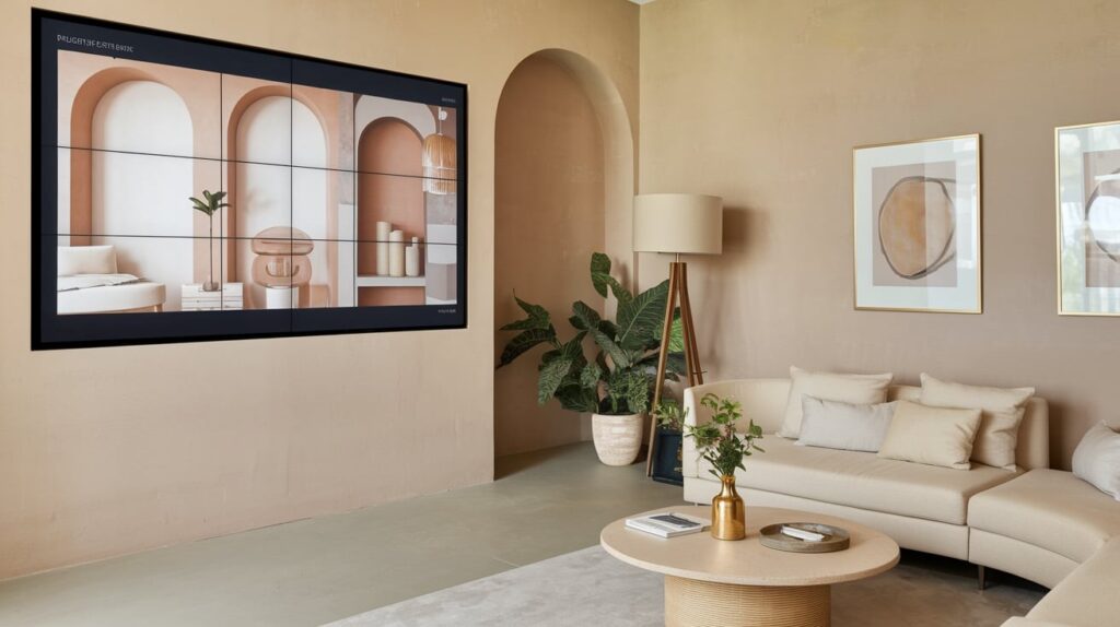
When you’re preparing a home for sale or rent, first impressions are everything. Buyers and tenants often make decisions within seconds of stepping through the door—or even just scrolling through photos online. In this fast-paced market, your property presentation plays a pivotal role, and the colour palette you choose can be the silent dealmaker. Among all the design choices available, neutral tones consistently emerge as the most effective choice. Here’s why.
1. Broad Appeal for Diverse Tastes
Neutral tones act as a blank canvas, allowing potential buyers or tenants to imagine themselves living in the space. Unlike bold colours, which can evoke strong personal preferences or aversions, soft greys, whites, taupes, and creams create an emotionally neutral environment that feels inviting to a wide range of people.
When you’re styling a property for sale or lease, it’s important to strip back overly personal touches. A brightly coloured feature wall or a vivid furniture piece might resonate with some, but it may alienate others. Neutral palettes remove this risk, helping you create harmony across various demographics and lifestyles—something crucial in today’s diverse housing market.
2. Complements a Wide Range of Furnishings
Another advantage of neutral colours is their incredible versatility. They serve as a subtle backdrop that allows furniture and décor, whether minimalistic or luxurious, to shine. This makes it easier for you to create a cohesive look without clashing colours or overcomplicating the visual narrative of the space.
When you’re staging a property using rented furniture, such as from providers likehuntleyandco.com.au, a neutral backdrop gives you far more flexibility in choosing pieces that suit the home’s design and appeal to your target market. It allows you to create a cohesive, aspirational look that can significantly boost your chances of securing stronger offers or attracting quality tenants.
3. Enhances Natural Light and Space Perception
Light plays a significant role in how large or small a room feels. Neutral tones, especially lighter shades, reflect more natural light, making spaces appear brighter and more expansive. This is particularly beneficial when you’re working with smaller rooms or properties with limited sunlight.
Your presentation is as much about feeling as it is about visual appeal. When rooms feel airy and open, they evoke comfort and spaciousness—key emotional triggers in a buyer or renter’s decision process. By using neutral tones on walls, flooring, and key furniture pieces, you can manipulate light in a way that maximises the perceived value and space of the property.
4. Supports Emotional Detachment and Faster Decisions
The process of selling or leasing a property is both emotional and transactional. Neutral tones help create a space that feels ‘move-in ready’ rather than tied to someone else’s style, making it easier for prospective occupants to project their own life and personality onto the space.
By removing emotional distractions, you make it easier for buyers and renters to focus on the property’s potential, its layout, its usability, and its lifestyle suitability—rather than dwelling on design choices they may not personally like. This often results in quicker decisions and reduced time on market.
5. Timelessness and Reduced Styling Costs
Trends in interior design come and go, but neutral tones remain a constant. Their timeless quality means you won’t need to refresh your styling as often, making them a cost-effective long-term choice. This is particularly beneficial if you’re a landlord or vendor who regularly stages properties.
Using a consistent neutral palette across multiple homes also simplifies your furniture and décor selection process when staging. You can reuse and reconfigure pieces easily, without needing trend-specific items that may quickly date or lose appeal.
Neutral by Nature, Powerful by Design
Neutral tones are more than a safe choice—they’re a strategic one. They offer flexibility, elevate visual space, boost emotional connection, and reduce styling costs over time. If you want faster sales, stronger offers, and better tenant appeal, choosing neutral tones in your property presentation may be the most effective decision you make.

