
Coordinating wood floor with wood cabinets doesn’t have to stress you out. I remember standing in the flooring store, paralyzed by fear of picking the wrong combination.
Would my kitchen look too matchy? Too busy? I get it because I’ve been there. The key is understanding a few simple principles rather than searching for perfect matches.
In this guide, I’ll walk you through contrast levels, undertones, and grain patterns that actually work. You’ll learn practical testing methods and see real examples of successful pairings.
I’ll show you how to create a balanced kitchen using light-dark combinations, finish choices, and visual breaks that feel intentional and pull everything together beautifully.
Choosing the Right Contrast
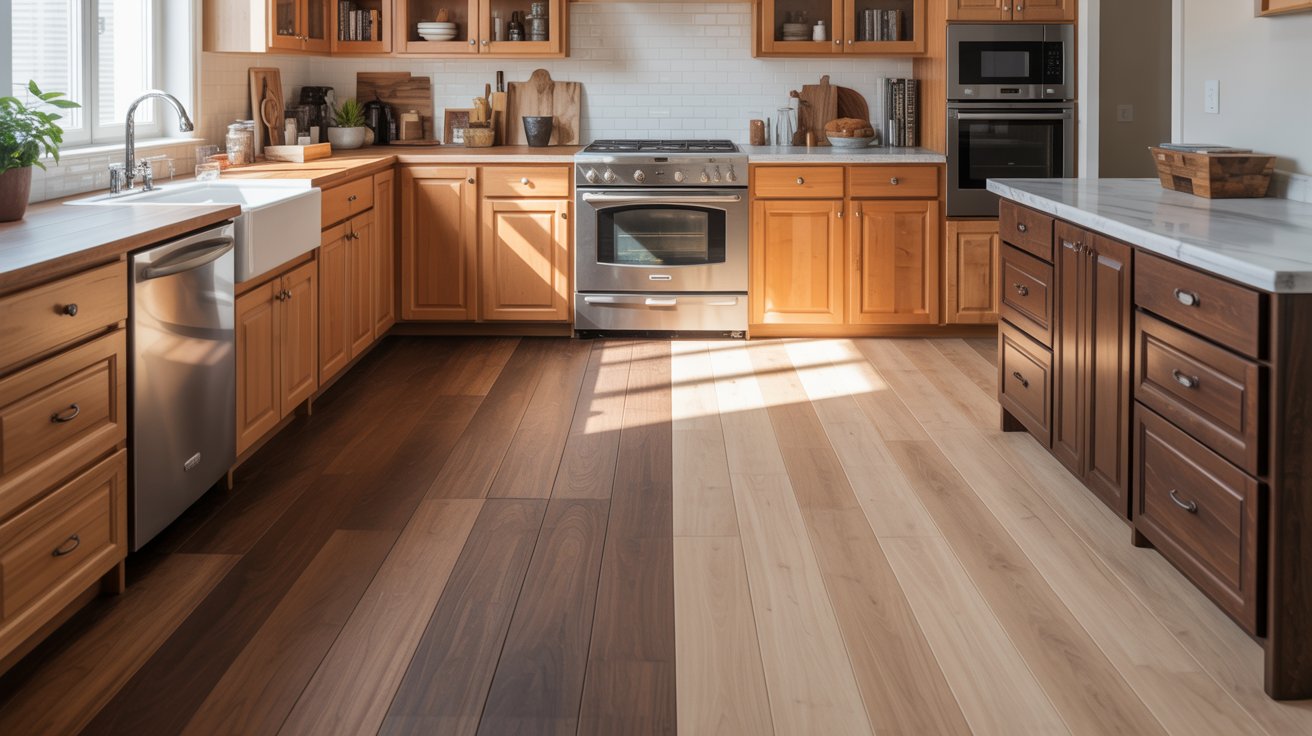
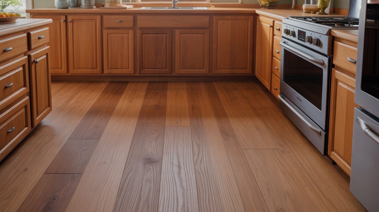
Light cabinets paired with dark floors add depth and prevent your kitchen from feeling flat. Maple or birch cabinets work beautifully with walnut or dark oak flooring. White oak cabinets look great with espresso-stained floors.
The light upper portion keeps the room feeling open while darker floors ground the space. This pairing works especially well in kitchens with lots of natural light.
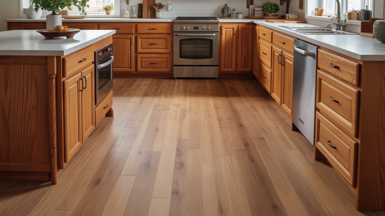
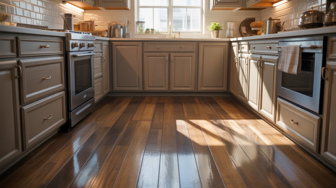
Dark cabinets with light floors create an open, airy feeling. The lighter floor reflects more light and makes the space feel larger. Cherry or walnut cabinets pair nicely with light ash or blonde oak flooring.
Espresso-stained cabinets look fantastic with natural maple floors. The contrast draws the eye upward to your cabinetry and works particularly well in smaller kitchens or spaces with limited windows
Considering Undertones for a Cohesive Look
Understanding undertones helps you create harmony between wood elements even when they’re different colors.
Warm Undertones
Warm undertones include red, orange, and yellow hues in the wood. These tones create inviting, traditional spaces that feel cozy.
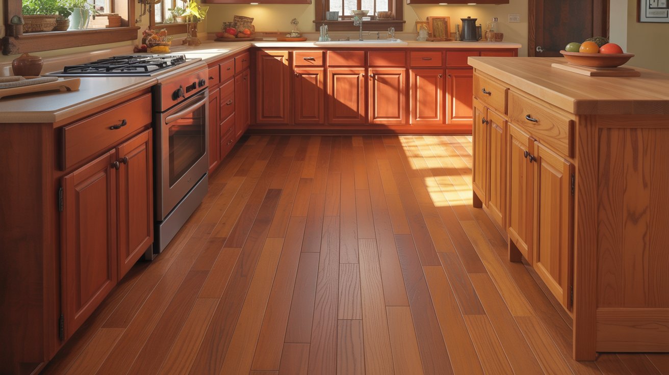
Cherry cabinets have strong red undertones. Pair them with flooring that has similar warmth, like Brazilian cherry or oak with honey tones. Hickory and pine also carry warm undertones that work together naturally.
Keep all your wood elements in the warm family. Mixing a warm cabinet with cool-toned flooring creates an awkward clash.
Cool Undertones
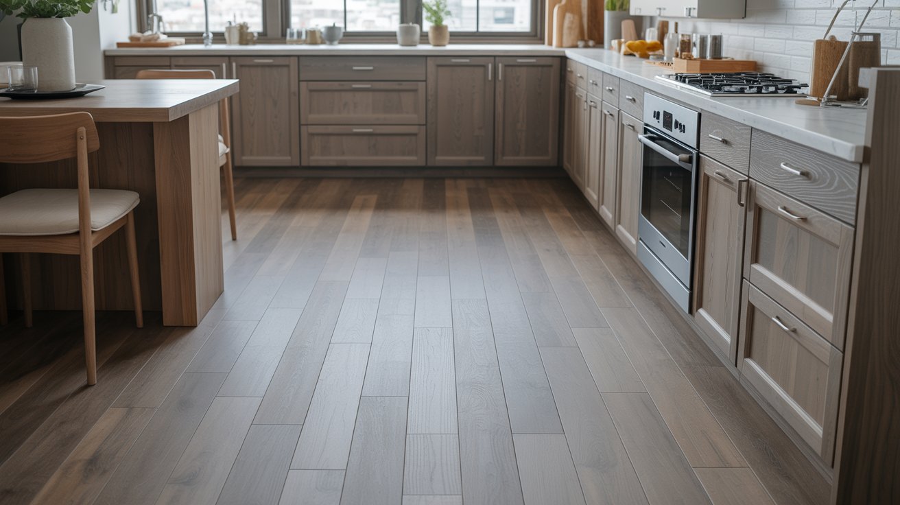
Cool undertones feature gray or neutral tones in the wood. These create calm, modern spaces with a clean aesthetic.
White oak and ash have natural gray undertones. Maple can lean cool depending on the finish. These woods pair well together and suit contemporary or Scandinavian-inspired designs.
Gray-washed or whitewashed finishes emphasize cool tones. Stick with flooring that has similar gray or neutral undertones to maintain cohesion.
Matching or Contrasting Grain Patterns
Grain patterns add another layer of visual interest to your wood coordination.
Complementary Grains
Complementary grains share similar characteristics. Both might have subtle, tight grain patterns or both might display bold, prominent graining.
Oak cabinets with their distinctive grain pair well with hickory flooring, which also has strong grain patterns. Maple cabinets with their fine, subtle grain work nicely with birch flooring.
This approach creates harmony through repetition. The similar patterns feel intentional and unified.
Contrasting Grains
Contrasting grains mix different pattern types for added texture. Pair linear, straight-grained cabinets with figured or wavy-grained flooring.
Cherry cabinets with their smooth, subtle grain contrast beautifully with oak flooring’s prominent grain lines. Maple’s fine texture stands out against hickory’s bold patterns.
This method adds visual complexity without creating chaos. The different patterns complement rather than compete with each other.
Practical Tips for Coordinating Wood Floors and Cabinets
Smart coordination strategies help you avoid costly mistakes.
Test Samples Together
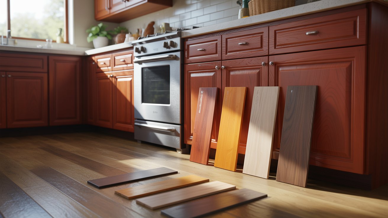
Never trust online photos or showroom lighting alone. Get actual samples of both your cabinet wood and flooring. Place them together in your kitchen.
View the samples at different times of day. Morning light looks different from afternoon or evening light. Natural light shows colors differently than artificial lighting.
Live with the samples for a few days. What looks good initially might start to bother you after repeated viewing.
Consider Finishes
Finish type drastically affects how wood appears. Matte finishes absorb light and show more of the wood’s natural character. Satin finishes offer subtle shine without being too reflective. Glossy finishes reflect light and can make spaces feel more formal.
Mixing finish types adds dimension. Matte cabinets with satin floors create subtle variation. Too much shine everywhere can feel overwhelming.
The finish also affects maintenance. Glossy surfaces show scratches and fingerprints more easily than matte options.
Introduce Visual Breaks
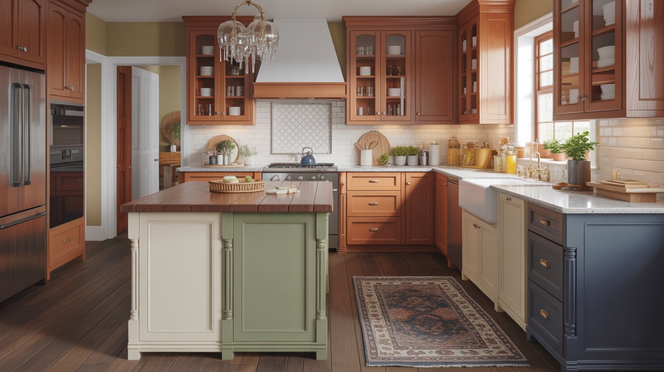
Too much wood creates monotony. Break up the visual field with other materials and colors.
Paint your kitchen island a contrasting color. This creates a focal point and prevents wood overload. White, navy, or sage green islands work well with most wood tones.
Your countertop material provides another break. Quartz, granite, or butcher block in a different tone separates cabinets from floors visually.
Area rugs in the kitchen add color and texture. They create zones and give your eyes a place to rest between wood surfaces.
Inspiration and Resources
Finding real examples helps you visualize combinations before committing.
Online platforms like Houzz and Pinterest show thousands of real kitchens. Search for your specific wood types to see how others have combined them. Save images that appeal to you and analyze what makes them work.
Look for kitchens with your cabinet color paired with different floor tones. Notice which combinations feel balanced and which seem off. Pay attention to undertones, contrast levels, and how other elements tie the space together.
Visit showrooms in person when possible. Photos can be deceiving. Seeing materials in person gives you a better sense of actual colors and textures.
Talk to kitchen designers or flooring specialists. They’ve seen countless combinations and can steer you away from pairings that don’t work well in practice.
Common Mistakes to Avoid
Avoiding these pitfalls will save you time, money, and regret when coordinating your wood elements.
- Don’t try to match wood tones exactly, as perfect matches often look flat and lack the depth that makes a kitchen interesting.
- Avoid mixing warm and cool undertones in the same space, which creates an awkward clash that feels unintentional and visually jarring.
- Don’t choose flooring and cabinets separately without testing samples together, as colors look completely different under your actual lighting conditions.
- Avoid using too much wood without visual breaks, which can overwhelm the space and make everything blend together uncomfortably.
- Don’t ignore the grain patterns, as mismatched grain intensity can create visual chaos even when colors coordinate well.
- Avoid glossy finishes on both floors and cabinets simultaneously, as too much shine creates glare and makes the space feel cold.
- Don’t rush your decision based on trends alone, since wood flooring and cabinets are long-term investments that should reflect your personal style.
Conclusion
Coordinating wood floor with wood cabinets is about balance, not perfection. I spent two months testing samples before choosing dark walnut floors with my light maple cabinets, and that patience paid off.
The contrast makes my kitchen feel pulled together and intentional. Focus on complementary undertones and good contrast rather than exact matches.
Test your samples in your actual lighting at different times of day. Trust your instincts when something feels right.
Drop a comment below sharing which wood combination you’re considering or what’s worked well in your home.
Frequently Asked Questions
Should wood floors match wood cabinets exactly?
No, exact matching usually looks flat and boring. Instead, aim for complementary tones with good contrast to create depth and visual interest in your kitchen.
Can I mix warm and cool wood tones?
Avoid mixing warm and cool undertones as they clash visually. Stick with all warm tones or all cool tones for a cohesive look throughout your kitchen.
What’s the best floor color for dark cabinets?
Light to medium-toned floors work best with dark cabinets. They create contrast, reflect more light, and prevent the space from feeling too heavy or enclosed.
How do I know if my wood has warm or cool undertones?
Compare your wood sample to pure white. If it looks yellow, orange, or red next to white, it’s warm. If it looks gray or neutral, it’s cool.
Do grain patterns need to match between floors and cabinets?
No, grain patterns don’t need to match. You can use complementary patterns for harmony or contrasting patterns for added texture and visual depth.