
This blog will tell you the difference between similar neutrals: balanced beige vs accessible beige.
Are you stuck in the beige dilemma? These two shades may look similar at first glance, but when you step closer, you’ll notice that each carries its hues and personalities. And just like selecting the right piece of furniture or fabric, choosing the perfect beige for your walls can set the tone of your entire room.
I’ll clear up all the differences and explore the nuances that make each beige unique, how they interact with lighting, and where they truly shine. Ready to uncover which beige is your true match? Let’s dive in.
What is Balanced Beige and Accessible Beige?
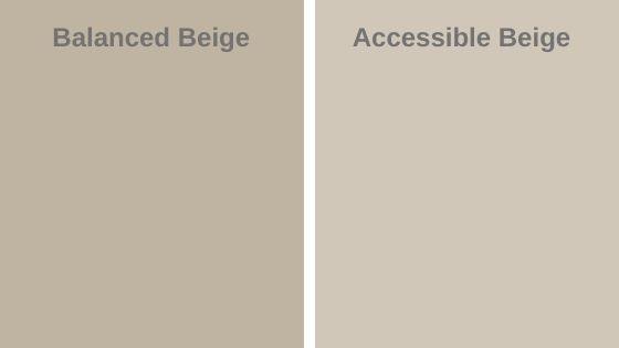
Balanced Beige (SW 7037)
Balanced Beige is a rich, medium-toned beige with a warm undertone that feels grounded and earthy.
It’s neither too dark nor too light, making it a great all-around neutral. What makes Balanced Beige stand out is its subtle gray undertones, which keep it from feeling too yellow or orange, giving it a sophisticated, refined edge.
This color works well in both traditional and modern spaces, offering a timeless warmth that feels cozy but not overpowering.
Accessible Beige (SW 7036)
Accessible Beige, on the other hand, leans slightly lighter and more subdued.
It has soft, neutral undertones with a touch of gray and green that help it adapt to a variety of lighting conditions.
This shade is perfect for creating a calm, relaxed atmosphere. Its versatility shines in spaces where you want a subtle backdrop that won’t compete with other design elements.
It’s warm enough to feel inviting, yet muted enough to let other colors shine.
Balanced Beige vs Accessible Beige
Here’s a table comparing Balanced Beige vs Accessible Beige along with their features:
|
Feature |
Balanced Beige (SW 7037) |
Accessible Beige (SW 7036) |
|
Primary Undertones |
Warm with subtle gray undertones |
Soft neutral with hints of gray and green |
|
Tone |
Medium beige with a deeper, richer warmth |
Lighter beige with a more muted, softer feel |
|
Best For |
Living rooms, dining rooms, family rooms, kitchens |
Bedrooms, bathrooms, hallways, open-concept spaces |
|
Atmosphere |
Cozy, grounded, and sophisticated |
Calm, airy, relaxed, and inviting |
|
Lighting |
Works well in both well-lit and dimly lit rooms |
Adapts well to both natural and artificial light |
|
LRV (Light Reflectance Value) |
47 |
58 |
|
RGB (Approx.) |
R: 172, G: 152, B: 132 |
R: 194, G: 177, B: 151 |
|
Ideal Room Size |
Medium to large rooms with sufficient natural light |
Small to medium-sized rooms, or areas requiring a lighter touch |
|
Style Compatibility |
Traditional, modern, rustic, transitional |
Modern, contemporary, coastal, traditional |
Comparing Undertones
Balanced Beige: Earthy, Warm, and Grounded
Balanced Beige is like a cozy blanket—warm and welcoming, with a hint of earthiness. Its undertones are heavily influenced by a soft gray, which helps keep the color grounded without turning it overly yellow or orange.
This subtle gray presence gives Balanced Beige a sophisticated, balanced feel that doesn’t scream for attention but creates a harmonious, cozy atmosphere.
If you’re looking for a beige that doesn’t overpower your space, but adds depth and richness, Balanced Beige could be your perfect match.
Accessible Beige: Soft, Muted, and Serene
On the other hand, Accessible Beige wears its undertones a little differently. While still warm, this shade leans into a blend of gray and a touch of green.
This greenish undertone is gentle and understated, making it incredibly versatile and adaptable. It creates a soft, serene ambiance, perfect for rooms that need a touch of neutrality but still want to feel warm and inviting.
The gray undertones help to cool down any sharpness, while the green undertone adds a soothing element, ideal for spaces that feel light and airy.
Comparing LRVs
Balanced Beige (LRV: 47)
Balanced Beige sits in the mid-range of the LRV scale, making it neither too dark nor too light.
With an LRV of 47, this color reflects a moderate amount of light, creating a rich, cozy ambiance that doesn’t feel overwhelming or too dim.
In north-facing rooms, where natural light tends to be cooler and more indirect, Balanced Beige works beautifully to add warmth.
In south-facing rooms, where sunlight is abundant and direct, Balanced Beige acts as a perfect neutral by softening the light. It prevents harsh shadows and creates a grounded, sophisticated look.
Accessible Beige (LRV: 58)
Accessible Beige, with an LRV of 58, leans a bit lighter than Balanced Beige, reflecting more light into your space. This shade feels airier and more open, which makes it an excellent choice for smaller rooms or spaces that need a boost of brightness.
In north-facing rooms, Accessible Beige shines by bringing a sense of lightness and warmth to cooler, darker spaces. Its lighter tone helps balance the lack of direct sunlight, making these rooms feel more inviting and open.
In south-facing rooms, Accessible Beige thrives under abundant sunlight. With its higher LRV, it reflects more light, creating a light and airy feel that enhances the natural flow of sunlight.
Coordinating Colors for Balanced Beige (SW 7037)
When it comes to coordinating colors, Accessible Beige, with its warm, earthy tone, pairs beautifully with soft whites like Sherwin-Williams Alabaster or even rich shades of green like Sage. These combinations create a cozy, welcoming feel—perfect for living spaces or kitchens.
If you want to keep things neutral, light grays like Agreeable Gray also complement Balanced Beige for a more refined, contemporary look. You can use these popular coordinating colors for Balanced beige:
- Agreeable Gray (SW 7029) – Soft warm gray.
- Creamy (SW 7012) – Warm off-white.
- Aesthetic White (SW 7035) – Light creamy neutral.
- Sanderling (SW 7513) – Light beige with gray.
- Colonnade Gray (SW 7641) – Medium gray with beige undertones.
- Cavern Clay (SW 7701) – Warm terracotta.
- Rookwood Dark Brown (SW 2806) – Rich, deep brown.
Coordinating Colors for Accessible Beige (SW 7036)
On the other hand, Balanced Beige offers a bit more of a taupe undertone, which gives it a bit more versatility when paired with cooler hues like navy or soft blues, such as Sherwin-Williams Naval.
You can experiment with these tones in different areas of your space, creating a smooth transition between rooms while still keeping things fresh and interesting. Below are the popular coordinating colors for Accessible Beige:
- Softer Tan (SW 6140) – Warm tan.
- Alabaster (SW 7008) – Soft warm white.
- Repose Gray (SW 7015) – Light cool gray.
- Bunglehouse Beige (SW 2845) – Deeper beige with brown.
- Natural Linen (SW 9109) – Soft warm beige.
- Dovetail (SW 7018) – Warm soft gray.
- Oyster Bay (SW 6206) – Muted cool greenish-gray.
Where to use Balanced Beige in your home?
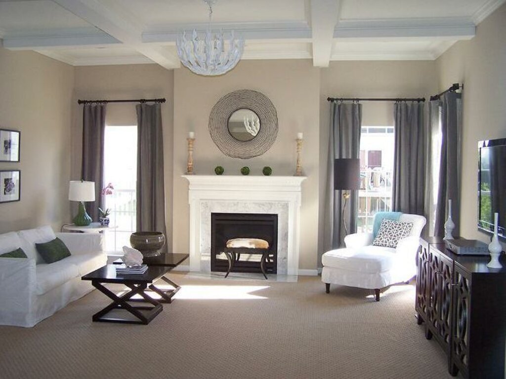
Balanced Beige is a versatile color for living rooms, bedrooms, hallways, and home offices, offering warmth and an inviting atmosphere. It works well in both large and smaller spaces, complementing a variety of furniture and decor styles.
It pairs beautifully with natural wood tones, warm fabrics, and metals like gold or brass. If you have darker furniture or previously painted surfaces, Balanced Beige provides a lovely contrast, maintaining a balanced and cohesive feel throughout.
For lighting, Balanced Beige performs well in both north-facing and south-facing rooms. In cooler, north-facing rooms, it adds warmth, while in brighter, south-facing spaces, it softens the light and creates a grounded, airy atmosphere.
Where to use Accessible Beige in your home?
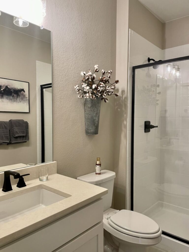
Accessible Beige is an ideal choice for spaces like kitchens, bathrooms, and dining rooms. In bathrooms, it creates a spa-like atmosphere when combined with white fixtures or soft blues.
Accessible Beige complements warm wood pieces and works well with textiles in soft neutrals or earthy tones. If you’re updating previously painted surfaces, it creates a smooth transition with both darker or lighter tones.
In terms of lighting, Accessible Beige works well in both north and south-facing rooms. In north-facing rooms, where light is cooler, it adds warmth and makes the space feel inviting.
In south-facing rooms, the color reflects the abundant sunlight, enhancing the light, airy atmosphere while maintaining a soft, grounded feel.
Conclusion
Choosing between Balanced Beige and Accessible Beige can be tricky, but both shades bring something unique to your space. So, which one should you choose? If you want a grounded, sophisticated warmth, Balanced Beige might be your perfect match. But if you need something lighter, more adaptable, and perfect for smaller or brighter rooms, Accessible Beige could be the way to go.
In the end, both of these shades offer timeless appeal and versatility, helping you create the perfect backdrop for your home. Now that you know their differences, you’re one step closer to finding the right beige for your space!
FAQs
How do the undertones in these two colors affect the overall vibe of a room?
Balanced Beige’s gray undertones keep it grounded and sophisticated, creating a cozy, welcoming environment. In contrast, Accessible Beige’s soft greenish-gray undertones add a serene, calm quality to a room, making it feel relaxed and light.
How do these colors perform under different lighting conditions?
Balanced Beige adapts well to both well-lit and dimly lit rooms, with its gray undertones helping it retain warmth even in cooler, darker spaces. Accessible Beige, with its higher LRV, reflects more light and adapts well to both natural and artificial lighting, creating an airy and open feel, especially in well-lit areas.
Which of these two colors is better for an open-concept space?
Accessible Beige is often the better choice for open-concept spaces due to its lighter, airy feel. It helps unify larger spaces while allowing natural light to flow. However, Balanced Beige can also work in open concepts if you want a richer, cozier atmosphere, especially when combined with plenty of natural light.
Can I use Balanced Beige and Accessible Beige together in the same room?
Yes! Since both colors are part of the beige family and share similar undertones, they can be used together to create a harmonious look. For example, you can use Balanced Beige on one wall to add warmth and Accessible Beige on others to keep the space feeling light and cohesive.
How do I know if Balanced Beige or Accessible Beige is the right color for my space?
Consider the size of the room, the lighting conditions, and the overall vibe you want to create. If you want a grounded, cozy, and sophisticated atmosphere with rich warmth, Balanced Beige is a great choice. If you need something lighter, more adaptable, and better for brightening smaller spaces, Accessible Beige would be a better fit.
How do I pair accent colors with Balanced Beige and Accessible Beige?
Balanced Beige pairs wonderfully with deeper accent colors like navy, olive, or charcoal for a grounded, sophisticated look. For Accessible Beige, light accent colors such as soft blues, whites, and muted pastels will help emphasize its airy, serene feel. Both colors allow bold accents like mustard yellow or coral to stand out without overwhelming the space.
Does the direction the room faces affect which beige to choose?
Yes, the direction of the room can influence your choice. Balanced Beige, with its more muted warmth, performs well in north-facing rooms with cooler light, adding warmth and coziness. Accessible Beige, due to its lighter nature, works well in south-facing rooms where it can enhance the natural light, making the space feel even brighter.