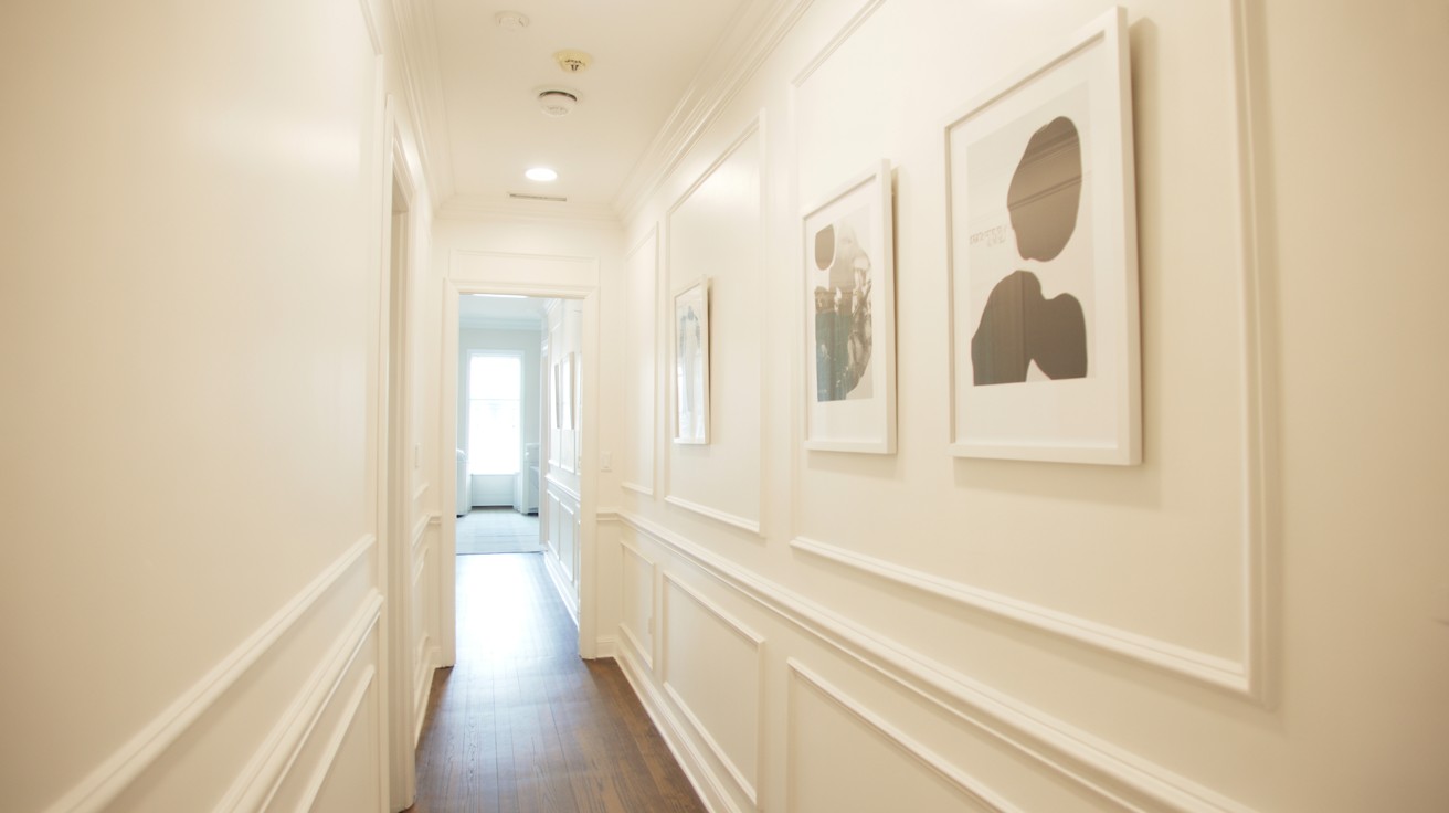
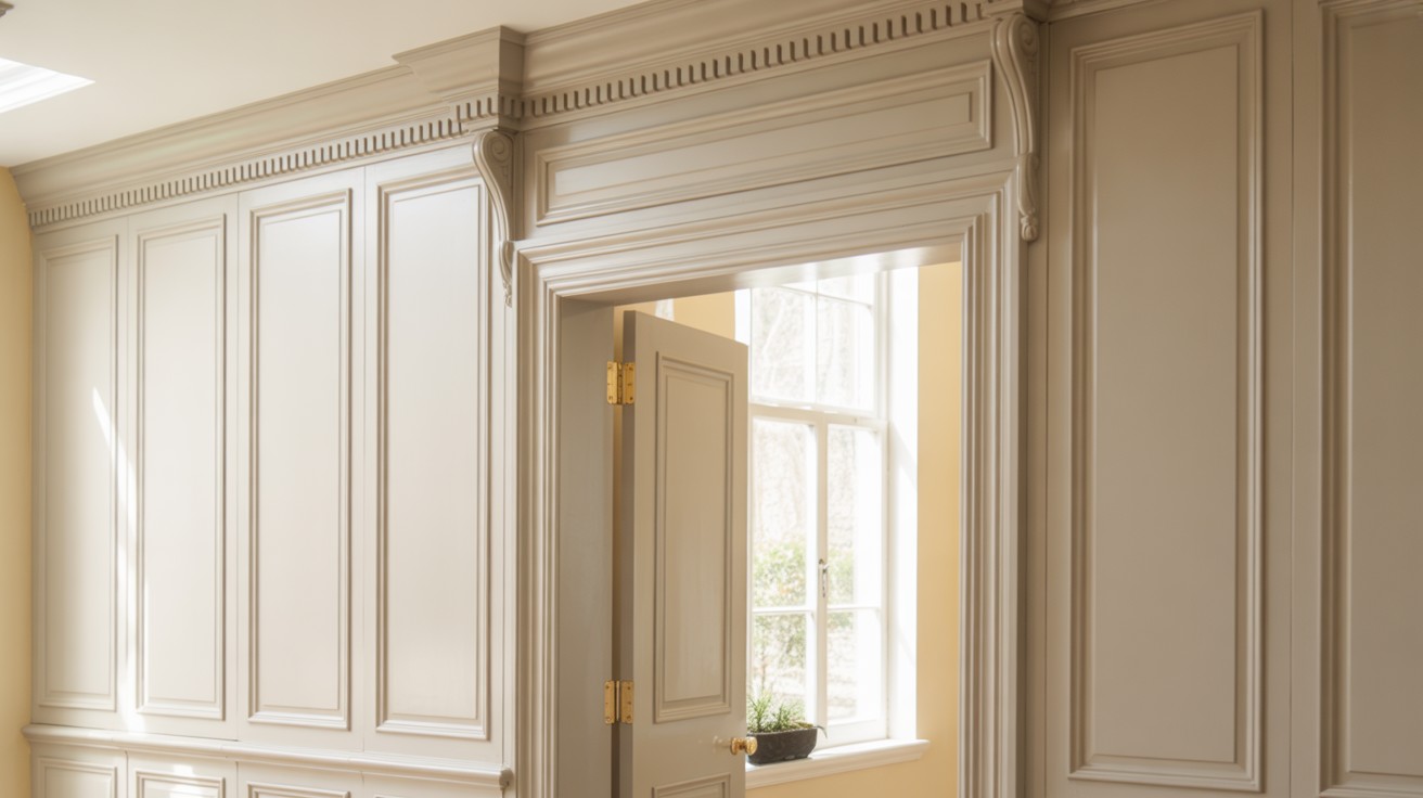
Sherwin-Williams Elegant Alabaster (SW 7008) stands as one of the most sought-after white paint colors in today’s interior design landscape.
This warm, creamy white has earned its reputation as a designer favorite and homeowner staple for good reason.
Unlike stark, clinical whites that can feel cold and unwelcoming, Alabaster offers a soft, inviting quality that works beautifully in any room.
Its subtle undertones create depth and warmth while maintaining the fresh, clean appearance that makes white paint so appealing.
From modern farmhouse kitchens to contemporary living spaces, this versatile shade adapts to various design styles with ease.
Interior designers consistently recommend Alabaster because it provides the perfect balance between pure white and off-white, making it an ideal choice for creating timeless, sophisticated interiors.
What Makes Alabaster White Special?
Alabaster’s unique characteristics set it apart from other white paints in the market today.
Soft, Warm, and Balanced Tone
This exceptional white strikes the perfect middle ground between stark brightness and overly creamy hues.
Alabaster provides subtle warmth that makes spaces feel inviting while maintaining the clean, fresh appearance that white paint delivers.
Its balanced formulation ensures rooms feel comfortable rather than cold or clinical.
Versatility Across Styles
Alabaster adapts seamlessly to various design approaches, making it a smart choice for any home.
Modern spaces benefit from its clean simplicity, while traditional rooms appreciate its warmth.
Farmhouse-style interiors love its cozy feel, and transitional designs find it bridges different elements beautifully.
Best Rooms to Use Alabaster White
Alabaster works beautifully in every space, from cozy bedrooms to bright kitchens and serene bathrooms.
Living Room
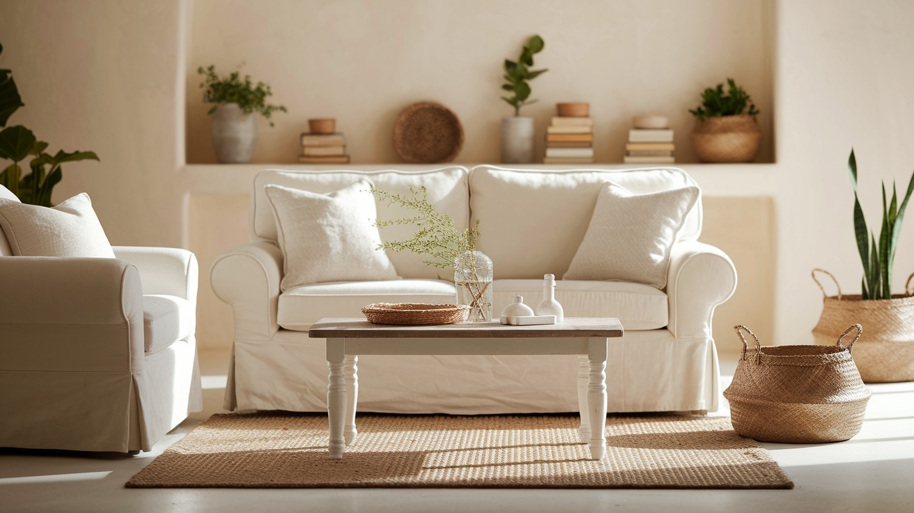
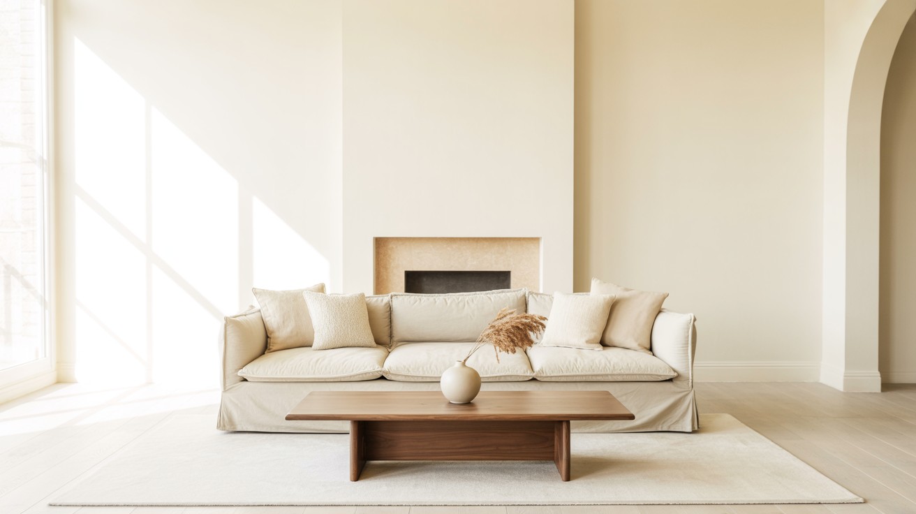
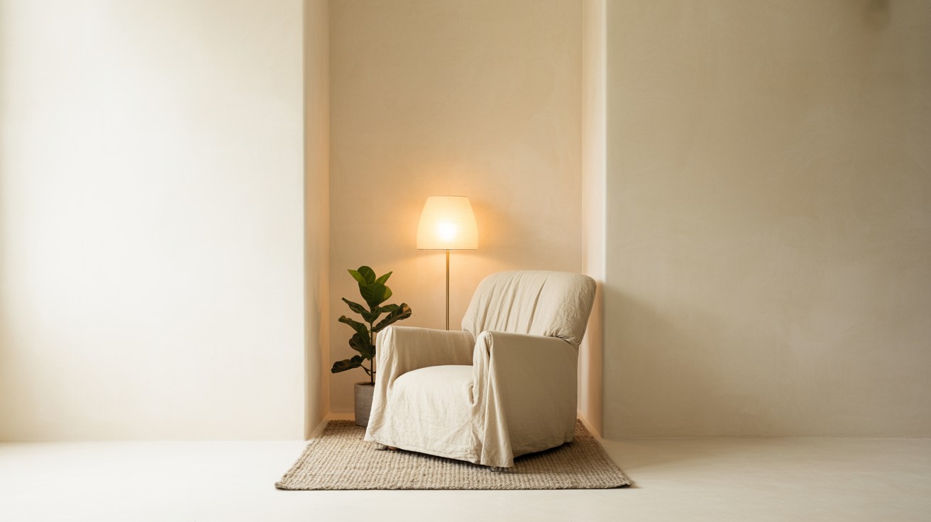
Alabaster creates a welcoming, comfortable atmosphere that makes any living space feel genuinely inviting and relaxed.
This warm white serves as an ideal backdrop for neutral furnishings and rich wood tones, allowing furniture pieces and decorative elements to stand out beautifully without competing for attention.
The color’s subtle depth and underlying warmth prevent walls from feeling flat or one-dimensional while maintaining the airy, open quality that makes rooms appear larger and more spacious than they actually are.
Kitchen
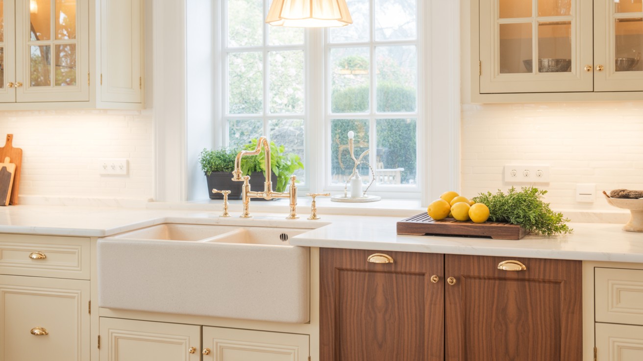
In kitchen spaces, Alabaster enhances both natural daylight and artificial lighting while preserving a cozy, homey feel that makes cooking and gathering enjoyable.
This versatile shade complements wood cabinetry exceptionally well, whether you choose traditional oak, contemporary maple, or rich walnut finishes.
It pairs beautifully with warm metallic hardware like gold or brass and works harmoniously with natural stone countertops including marble, granite, or quartz surfaces for a cohesive, timeless look.
Bedroom
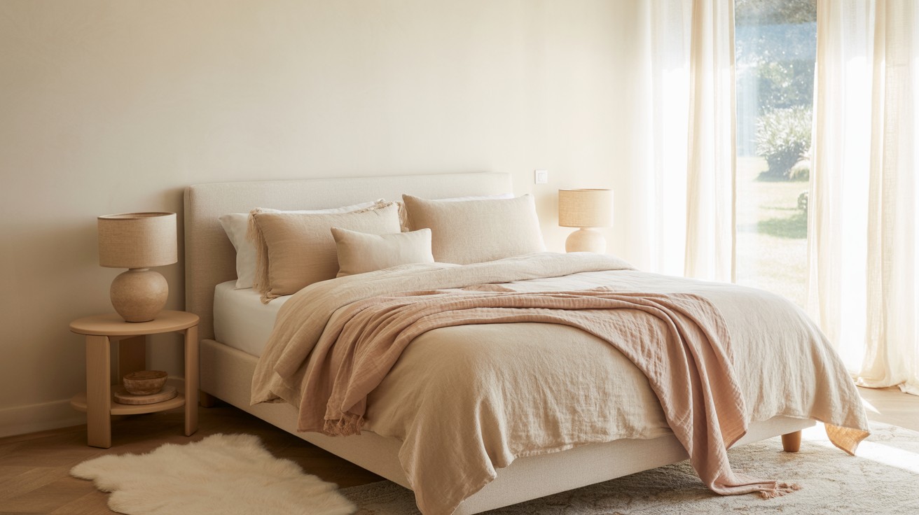
Alabaster’s inherently soft, peaceful quality makes it perfect for creating restful bedroom environments that promote relaxation and restorative sleep.
The color works wonderfully with muted accent tones, plush textiles, and warm wood furniture pieces, contributing to a serene atmosphere.
Its gentle warmth creates a cocoon-like feeling that helps bedrooms feel like true retreats from daily stress while maintaining enough brightness to keep spaces from feeling dark or cramped.
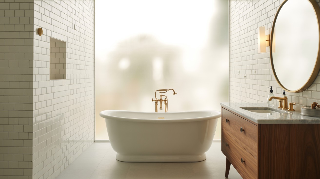
Bathroom
This versatile white creates a clean, serene feel in bathrooms while carefully avoiding the sterile, clinical appearance that cooler whites can sometimes produce.
Alabaster matches beautifully with classic white subway tile, warm brass or gold fixtures, and natural materials like wood vanities or stone accents.
The color’s subtle undertones add sophistication while maintaining the fresh, spa-like atmosphere that makes bathrooms feel luxurious and calming for daily routines.
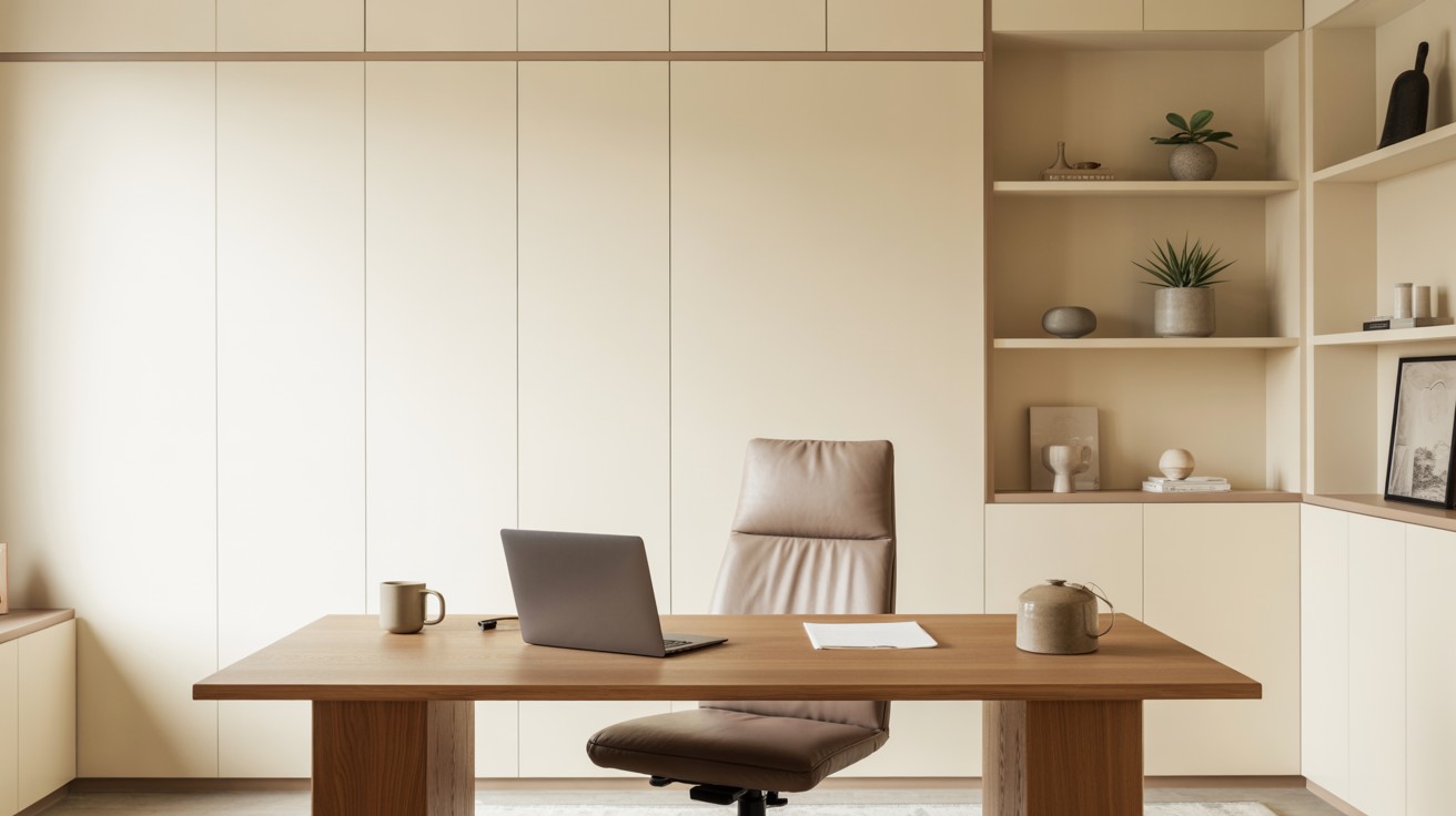
Home Office
For workspace environments, Alabaster promotes focus and concentration without the harsh brightness that can cause eye strain during long work sessions.
Layer it strategically with warm greiges or soft taupe accent colors to create a comfortable, productive environment that feels professional yet welcoming.
The color’s balanced tone helps maintain alertness while providing enough warmth to make home offices feel less clinical and more inspiring for creative work.
Using Alabaster on Exteriors
Alabaster’s versatility extends far beyond interior spaces, making it an exceptional choice for exterior home applications where you want to achieve both warmth and sophisticated appeal while maintaining the color’s signature inviting character.
Siding, Trim, and Porches
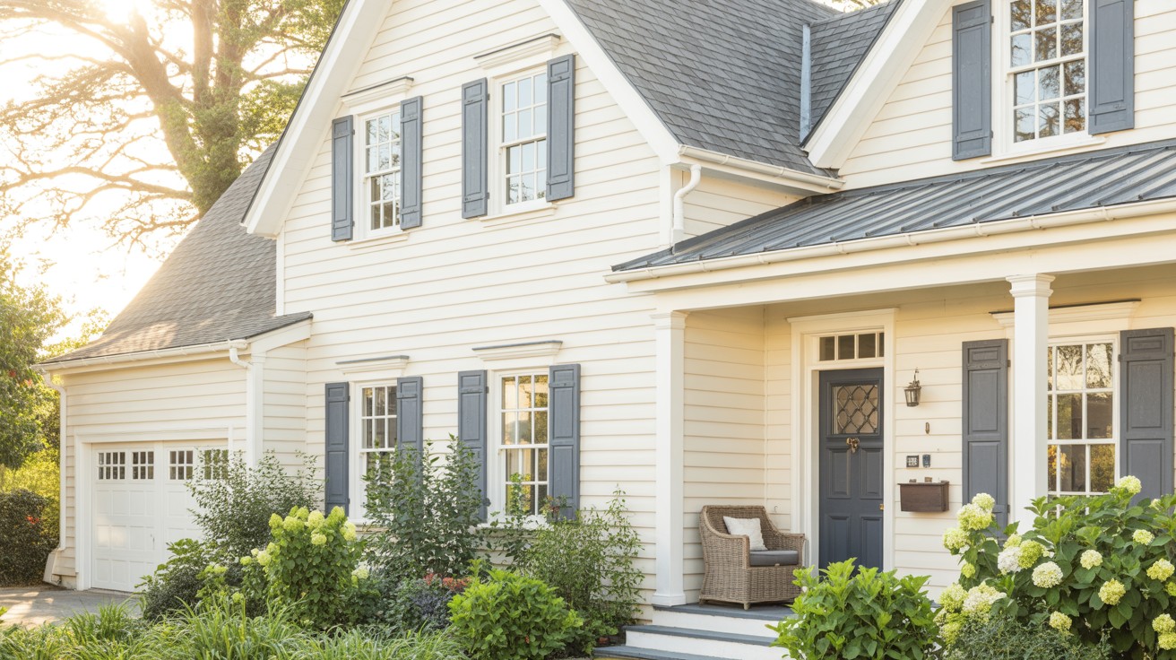
For exterior siding applications, Alabaster provides a clean yet warm appearance that feels genuinely inviting rather than cold or stark like many traditional whites.
This balanced shade works beautifully on various siding materials including vinyl, fiber cement, wood, and stucco.
The color creates stunning visual contrast when paired with darker accent colors such as Iron Ore or Urbane Bronze on shutters, garage doors, or architectural details.
On covered porches and outdoor living spaces, Alabaster maintains its welcoming quality while standing up effectively to weather conditions.
The color’s subtle undertones prevent it from appearing flat or boring on large exterior surfaces, instead adding depth and visual interest that changes beautifully throughout different lighting conditions during the day.
Front Door Accent Ideas
Use Alabaster strategically on exterior trim work to create beautiful frames for bold front door colors that make powerful first impressions.
Navy blue front doors look particularly striking against Alabaster trim, creating a classic nautical-inspired combination that never goes out of style.
Charcoal gray doors offer a more contemporary approach while maintaining sophistication, and deep forest green creates an organic, nature-inspired feel that works especially well with traditional and farmhouse-style homes.
The neutral warmth of Alabaster trim allows these bold door colors to truly shine while providing a cohesive transition between the main house color and accent features.
Finish and Sheen Recommendations
Choosing the right finish enhances Alabaster’s beauty while providing appropriate durability for different surfaces and room functions.
Flat/Matte
Perfect for walls in living rooms and bedrooms where you want to minimize surface imperfections and create a soft, comfortable atmosphere.
This finish hides wall flaws beautifully while providing a smooth, non-reflective surface that makes Alabaster’s warm undertones appear rich and velvety.
The matte texture adds sophistication to relaxation spaces while reducing glare from windows and artificial lighting sources, making rooms feel more intimate and cozy.
Eggshell/Satin
The ideal choice for kitchens, bathrooms, and hallways where durability and easy cleaning are essential without excessive shine or reflection.
This finish offers the perfect balance between protection and subtle sheen, making it practical for high-traffic areas that need regular maintenance.
Eggshell enhances Alabaster’s warmth while providing enough resilience to withstand moisture, fingerprints, and frequent wiping without losing its beautiful appearance over time.
Semi-Gloss/Gloss
Best reserved for trim work, doors, and cabinetry where moisture protection and frequent cleaning are necessary for longevity.
This finish adds subtle definition and architectural interest while providing maximum durability against daily wear.
The slight shine helps Alabaster’s trim work stand out beautifully against matte walls, creating visual depth and highlighting architectural details like crown molding, baseboards, and door frames with classic contrast.
Tips for Sampling Alabaster
Proper sampling ensures you’ll love how Alabaster looks in your specific space and lighting conditions.
Always View in Natural Light
- Observe your paint samples at different times throughout the day to understand how natural light affects Alabaster’s appearance and warmth
- Morning light reveals cooler undertones, while afternoon sun brings out the color’s inherent warmth and creaminess
- Evening light shows how the color appears under artificial lighting conditions
- This comprehensive viewing process helps you understand exactly how Alabaster will look in your room throughout daily activities, ensuring no surprises after painting
Compare with Other Whites
- Test Alabaster directly against Pure White (SW 7005) or Extra White (SW 7006) to better understand its unique undertones and characteristics
- Place sample swatches side by side on the same wall surface to see the subtle differences clearly
- Pure White appears cooler and more stark, while Extra White has slightly different undertones that become apparent in comparison
- This side-by-side evaluation helps you choose the perfect white for your specific design goals and room lighting conditions
Conclusion
Sherwin-Williams Alabaster (SW 7008) stands as a truly timeless and adaptable white paint choice that works beautifully in any room of your home.
Its perfect balance of warmth and cleanliness makes it an exceptional option for homeowners seeking a versatile color that complements various design styles and room functions.
From creating cozy bedroom retreats to brightening kitchen spaces, Alabaster consistently delivers the sophisticated yet welcoming atmosphere that makes houses feel like homes.
The color’s ability to work harmoniously with different lighting conditions, furniture styles, and accent colors makes it a smart investment for long-term satisfaction.
We strongly encourage you to sample Alabaster in your own space, observing how it interacts with your specific lighting and existing elements.
Once you experience its gentle warmth and timeless appeal firsthand, you’ll understand why designers and homeowners continue to choose this exceptional white paint for creating beautiful, comfortable living spaces.
Frequently Asked Questions
What undertones does Sherwin-Williams Alabaster have?
Alabaster has subtle warm undertones that prevent it from appearing stark or cold like pure whites. These gentle cream undertones give the color its welcoming, cozy quality while maintaining a fresh, clean appearance.
Can I use Alabaster on both walls and trim?
Yes, Alabaster works beautifully on both walls and trim, creating a cohesive monochromatic look. For added definition, consider using different sheens – matte for walls and semi-gloss for trim work.
How does Alabaster compare to other popular white paints?
Alabaster is warmer than Pure White or Extra White, making it feel more inviting and less clinical. It offers the perfect middle ground between stark whites and creamy off-whites for versatile application.
What lighting conditions work best with Alabaster?
Alabaster performs well in both natural and artificial lighting, adapting beautifully throughout the day. It looks particularly stunning in rooms with good natural light, where its warm undertones can shine.
What colors pair well with Alabaster for accent walls or decor?
Alabaster coordinates beautifully with warm neutrals like Agreeable Gray, Accessible Beige, or natural wood tones. It also provides an excellent backdrop for bolder accent colors like navy, forest green, or charcoal.

