
Ever stood in a tile showroom feeling completely overwhelmed? You’re not alone. Choosing the right tile is hard enough, but then comes the grout decision that can make or break your entire look.
In this guide, I’ll walk you through exactly how to pair tiles and grout for any room in your home. You’ll learn which combinations create dramatic statements, which ones offer timeless elegance, and which ones might be a design mistake.
After years of installing tile in hundreds of homes, I’ve seen what works, and what homeowners regret. The tips I’m sharing today have helped countless clients create spaces they truly love.
Whether you’re tackling a kitchen backsplash, bathroom renovation, or floor project, you’ll finish this article knowing exactly how to choose a tile and grout combination that looks professional and reflects your personal style.
Understand the Role of Grout in Design
Grout isn’t just the stuff between your tiles. It’s actually a key player in your overall design. Let me explain why it matters so much.
First, grout has two main jobs. It keeps your tiles securely in place and prevents water from seeping underneath. But beyond that practical purpose, grout is a design element that can completely transform how your space looks.
Here’s what grout actually does for your design:
- Creates visual patterns or makes them disappear
- Makes small rooms feel bigger (or smaller)
- Highlights tile shapes or blends them together
- Adds contrast or creates a seamless look
Many people think grout is just functional, but I’ve seen the right grout choice turn an ordinary tile job into something special.
Let’s bust a common myth: grout doesn’t have to be white or beige. I’ve used blacks, blues, and even reds that looked fantastic in the right setting.
The width of your grout lines matters too. Thin lines create a clean, modern look. Wider lines make a bolder statement and work well with handmade or irregular tiles.
Remember this: your eye will naturally follow grout lines around a room. Use this to your advantage when planning your design.
Consider the Look You Want to Achieve
Your tile and grout combination sets the mood for your entire space. I’ve helped hundreds of homeowners choose combinations that match their vision. Let me walk you through your main options.
1. Seamless and Subtle
When you match your grout color closely to your tile, you create a continuous surface that feels expansive and calm.
This works well when:
- You want to make a small bathroom feel bigger
- Your tiles have a beautiful pattern you want to showcase
- You’re going for a minimalist, clean look
I recently installed white subway tiles with light gray grout in a kitchen, and my client was amazed at how much larger the space felt compared to the previous dark grout lines.
2. Bold and Defined
Contrasting grout makes a statement. Dark grout with light tiles (or vice versa) highlights the shape and pattern of each tile.
This approach shines when:
- You’re using interesting tile shapes (hexagons, arabesque, etc.)
- You want to create visual texture
- Your style leans toward dramatic or industrial
White penny tiles with black grout create a classic look that never goes out of style. I’ve installed this combo in dozens of bathrooms that still look fresh years later.
3. Balanced and Blended
The middle ground is a tone-on-tone approach. This means choosing grout that’s a few shades lighter or darker than your tile.
This option is perfect if:
- You want definition without high contrast
- Your room already has bold elements
- You’re looking for something timeless
For natural stone tiles, I often pick a grout that matches the darkest flecks in the stone. This creates a cohesive look that feels intentional but not overwhelming.
Your ideal look depends on your personal style and the specific room. What works in a powder room might be too busy for a master bathroom. Trust your gut reaction when looking at samples.
Assess the Tile Material and Finish
Different tile materials need different grout approaches. I’ve seen beautiful tile ruined by the wrong grout choice. Let’s avoid that mistake for your project.
1. Porcelain and Ceramic Tiles
These common tiles come in endless colors and finishes. Their consistent surface makes them versatile with most grouts.
For glossy finishes:
- Consider lighter grout to keep the bright, reflective quality
- Be aware that dark grout against white glossy tile creates an extremely high-contrast look
For matte finishes:
- You have more flexibility since the light doesn’t bounce as much
- Matching grout creates a sophisticated, modern look
I installed the same white subway tile in two different bathrooms – one with a glossy finish and one matte. The glossy bathroom felt much more dramatic with dark grout than the matte one did.
2. Natural Stone
Stone tiles have unique personalities. They have natural variations that affect your grout choice.
With marble, travertine, or slate:
- Look for grout that matches the veining or the dominant stone color
- Avoid bright white grout – it rarely looks natural
- Consider slightly darker grout to hide inevitable staining
When I work with natural stone, I always bring the actual tile to match grout colors in person. Photos don’t capture the subtle variations.
3. Glass Tile
Glass is tricky! It’s transparent and reflective, which means:
- The grout color might show through translucent tiles
- Light bounces differently, making colors appear more intense
- Contrasting grout can create a “grid-like” effect
For a recent glass backsplash project, we tested three different grout colors before finding one that didn’t distort the beautiful blue-green of the tile.
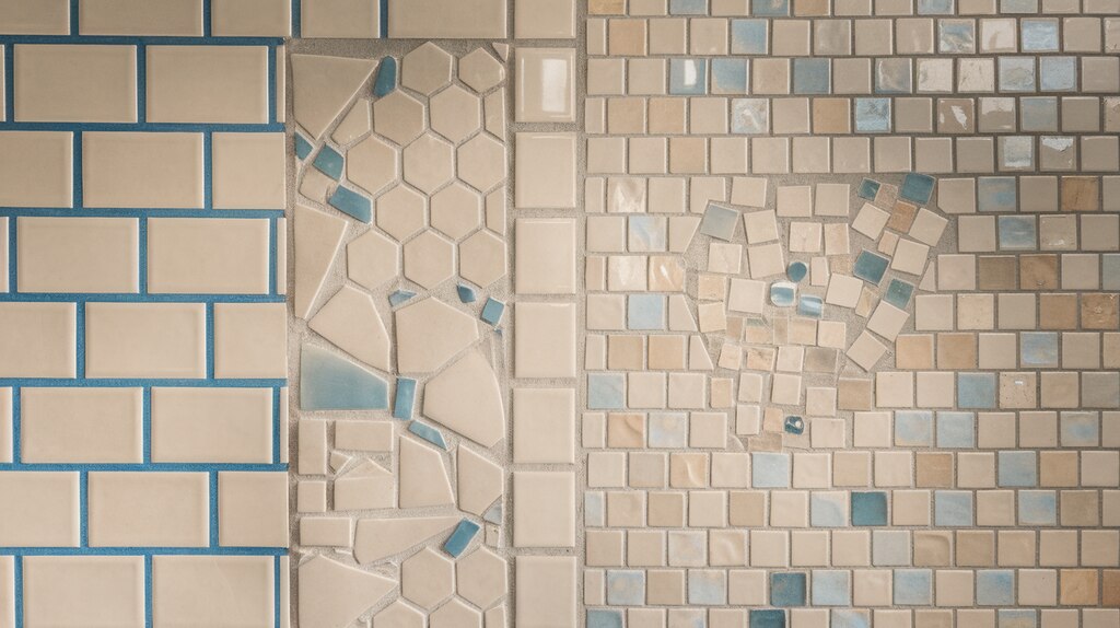
4. Textured or Handmade Tiles
Uneven tiles need special consideration.With handmade tiles, zellige, or textured stone:
- Darker grout hides irregularities better
- You’ll need wider grout lines to accommodate variations
- Consider the grout’s texture too – sanded vs. unsanded
The rustic, artisanal look of handmade tiles pairs beautifully with grout that has a bit of character itself. Don’t try to make these tiles look perfect – their charm lies in their uniqueness.
Grout Color Options Explained
Your grout color affects both style and practicality. I’ve spent years installing and replacing grout, so I know which choices people love long-term and which they regret.
1. Light Grout
Light grout creates an airy, clean look that many homeowners love.
Pros:
- Makes spaces feel larger and brighter
- Creates a seamless look with light-colored tiles
- Works well in contemporary and traditional spaces
Cons:
- Shows dirt, mildew, and stains easily
- Requires more frequent cleaning
- Can yellow over time in high-moisture areas
I installed white grout in my own kitchen and it looked stunning, for about six months. Now I seal it twice yearly to keep it looking fresh.
2. Dark Grout
Dark grout is practical and striking. From charcoal to deep brown, these colors add definition.
Pros:
- Hides dirt and stains brilliantly
- Creates dramatic contrast with light tiles
- Requires less maintenance
- Ages gracefully
Cons:
- Can make small spaces feel smaller
- Might fade unevenly in sunlight
- Can look too industrial in some settings
Dark grout transformed a client’s white hex tile bathroom floor from boring to bold. Five years later, it still looks freshly installed despite heavy foot traffic.
3. Colored Grout
Beyond neutrals, there’s a rainbow of possibilities that few people consider.
When colored grout works well:
- In children’s bathrooms (navy, teal, soft pink)
- For artistic or bohemian spaces
- When you want a subtle color connection to other elements
- In commercial or creative spaces
A client chose pale blue grout with white tile to tie in their coastal theme, and it created a subtle, unique look that guests always comment on.
4. Specialty Grout
These aren’t just for the daring. Special grout types add unexpected dimension.
- Metallic grout: Tiny reflective particles add subtle shimmer
- Glitter grout: More noticeable sparkle effect, popular in accent areas
- Epoxy grout: Ultra-durable and stain-resistant (but harder to install)
- Urethane grout: No sealing required, resists stains and cracking
In a recent shower installation, I used epoxy grout with subtle gold flecks that catch the light. It’s both practical (no sealing needed!) and adds a touch of luxury you’d never get from standard grout.
Always test specialty grouts in a small area first. What looks subtle in a sample might feel overwhelming across an entire wall.
Popular Tile & Grout Color Combinations
Some combinations stand the test of time while others create fresh, modern looks. I’ve installed thousands of square feet of tile, and these pairings consistently make my clients happy.
1. Classic Combinations
White subway tile + light gray grout: This might be the most popular pairing I install. It’s clean without being stark and hides minor discoloration better than white grout would.
Marble tile + beige or taupe grout: I match the grout to the softest veining in the marble for a natural, cohesive look. This lets the beauty of the stone shine.
Black hexagon tile + black grout: For dramatic powder rooms or statement floors, this monochromatic look creates depth without busy lines. The uniformity feels luxurious.
2. Modern Favorites
White tile + black grout: This high-contrast combination never fails to make a space feel fresh and graphic. It works especially well with geometric shapes like hexagons or penny rounds.
Gray tile + white grout: The reverse of the classic contrast look creates a softer but still defined pattern. I used this in a client’s large shower and it made the space feel both cozy and crisp.
Blue tile + navy grout: For those wanting color without contrast, this tone-on-tone approach feels contemporary yet timeless.
3. Trending Combinations
Terracotta tile + warm brown grout: This earthy combination has made a huge comeback. The grout enhances the natural warmth without competing with the tile’s character.
Green tile + charcoal grout: Green tiles (from sage to emerald) paired with dark gray grout create a stunning, nature-inspired look that’s gaining popularity.
Wood-look tile + taupe grout: I choose grout that matches the mid-tone of the “wood” to enhance the realistic appearance. Too light or dark breaks the illusion.
4. Room-Specific Winners
For kitchens: Light-colored tile with medium gray grout hides food splatter while still looking clean.
For bathroom floors: Medium to dark grout regardless of tile color, trust me on this one! Light grout on floors requires constant maintenance.
For shower walls: Either match your grout closely to create a seamless look or go for deliberate contrast. The middle ground often looks like a mistake.
Remember: trends come and go, but function lasts forever. Choose combinations that you’ll enjoy looking at daily and that suit your cleaning habits.
Practical Considerations
Beautiful tile work can become a nightmare if you ignore these practical details. After years of both installing tile and fielding frantic calls from homeowners with grout problems, I’ve learned what really matters for long-term satisfaction.
1. Grout Maintenance and Cleaning
Your lifestyle should influence your grout color choice more than design trends.
Light grout requires:
- More frequent cleaning (at least monthly deep cleans)
- Immediate attention to spills
- Regular scrubbing with grout-specific cleaners
Dark grout needs:
- Less intensive cleaning routines
- Attention to potential fading in sunny areas
- Occasional refreshing with color sealers
I tell busy families with kids to always choose medium to dark grout in bathrooms and kitchens. The extra maintenance of light grout becomes a real burden.
2. Stain Resistance and Sealing
Not all grout is created equal. Standard cement grout is porous and will stain unless sealed properly.
For better protection:
- Seal traditional grout every 6-12 months
- Consider upgrading to epoxy or urethane grout in wet areas
- Use stain-resistant additives when mixing traditional grout
I installed standard grout in my first home and spent hours sealing it yearly. In my current house, I paid extra for premixed stain-resistant grout and haven’t needed to seal it once in three years.
3. Traffic Considerations
High-traffic areas need durable solutions:
- Entryways and hallways benefit from darker grout that hides dirt
- Kitchen backsplashes near stoves should avoid white/light colors
- Shower floors need stain and mildew-resistant options
For a rarely-used guest bathroom, you can prioritize aesthetics. For your main bathroom? Prioritize practicality.
Testing Before Committing
Never choose grout from a tiny color chart alone! This is a mistake I see constantly.
Instead:
- Create a small mockup using leftover tiles
- Apply different grout options in sections
- View the samples in your actual space’s lighting
- Let the samples fully cure (colors often lighten as they dry)
For a recent kitchen renovation, my client was set on light gray grout until our test panel showed how it would highlight every fingerprint around the cooking area. She switched to medium gray and has been thankful ever since.
Remember: grout is permanent unless you’re willing to undertake a difficult removal process. Taking time to test options saves both money and frustration later.
Tips from Interior Designers
Professional designers have tricks that make tile work look intentional rather than accidental. I’ve partnered with dozens of designers over the years, and they consistently share these insider approaches.
1. Room-Specific Recommendations
For bathrooms:
- “In shower floors, avoid white grout at all costs. Even with sealing, it will discolor.” —Designer Beth M.
- “For bathroom walls, light grout with light tile makes the space feel larger and brighter.” —Designer James T.
For kitchens:
- “Near cooktops, darker grout prevents permanent staining from cooking oils and tomato sauces.” —Designer Anna K.
- “In open-concept homes, match your kitchen backsplash grout to other grout in sight lines for visual flow.” —Designer Michael P.
I recently worked with a designer who chose medium gray grout for an all-white kitchen. Her reasoning? “It’s the perfect compromise between showing some dirt and showing all dirt.”
2. Balancing Trends with Timeless Choices
Smart designers know how to incorporate trends without dating a space.
- Use trending tile patterns with classic grout colors
- Save bold grout choices for spaces that are easily updated (like a powder room)
- Consider the home’s resale timeline when making choices
Designer Sophia R. shared: “I tell clients to go classic with permanent elements and trendy with changeable ones. Tile and grout are definitely in the ‘permanent’ category.”
3. Strategic Contrast
Knowing where to create contrast makes all the difference.
For accent walls:
- Bolder contrast draws the eye and creates a focal point
- Consider darker grout even with dark tile to emphasize the pattern
For full-room coverage:
- Softer contrasts prevent visual overwhelm
- Consistent grout color throughout creates continuity
I worked on a project where the designer used the same marble-look tile throughout a bathroom but varied the grout—darker on the accent wall behind the tub, lighter everywhere else. This subtle difference created depth without requiring different tiles.
4. Designer Secrets
Little-known tips that make a big difference:
- “Choose sanded grout for floors even when unsanded would work. It hides dirt better and feels more substantial underfoot.” —Designer Thomas B.
- “When using multiple tile types in one space, use the same grout color throughout to tie everything together.” —Designer Elena M.
- “Take photos of your mockups in different lighting conditions. What looks perfect at noon might look terrible at 6 PM.” —Designer Kaitlyn R.
The best designers don’t follow rigid rules. Instead, they consider the unique characteristics of each space, the client’s lifestyle, and the overall design vision.
Conclusion
Choosing the right tile and grout combination doesn’t need to be overwhelming. By understanding how grout affects both the look and function of your space, you can make confident decisions that you’ll love for years.
Remember to consider:
- The visual effect you want to achieve
- The practical demands of each space
- The specific needs of your tile material
Don’t rush this decision. Take time to test samples in your actual space and lighting. What looks perfect in a showroom might feel completely different in your home.
Most importantly, balance your design vision with maintenance reality. The most beautiful combination won’t bring joy if it creates cleaning headaches.
Armed with these tips and insights, you’re now ready to make choices that will enhance your home both aesthetically and functionally. Your perfect tile and grout combination awaits!
Frequently Asked Questions
How do I match grout color to tile?
Match grout to either the primary tile color (for a seamless look) or to a secondary color within the tile (like matching veining in marble). For the most accurate match, always view samples in your actual space with the lighting you’ll have, not just in the store.
Is darker or lighter grout better for floors?
Darker grout is generally better for floors, especially in high-traffic areas or households with children and pets. It hides dirt, footprints, and stains much better than light grout. Even medium-toned grout performs significantly better than white or light beige on floors.
Can I change my grout color without replacing the tile?
Yes, you can update your grout color using a grout colorant or grout refresh product. This works best when going from light to dark. Complete grout removal and replacement is also possible but more labor-intensive and best done by professionals.
How wide should my grout lines be?
For most wall tiles, 1/16″ to 1/8″ grout lines work well. Floor tiles typically need 1/8″ to 3/16″ lines. Handmade or irregular tiles require wider lines (3/16″ to 1/4″) to accommodate size variations. Wider lines are more noticeable, so consider this in your overall design.
Do I need to seal my grout after installation?
Yes, unless you’re using non-porous grout like epoxy or pre-sealed options. Traditional cement grout should be sealed 48-72 hours after installation and then resealed every 6-12 months depending on the area’s moisture exposure and traffic. Sealing is essential for preventing stains and mildew growth.